UX Writing: Guidelines for good UX texts

07. February 2023 - from Maya Walther

In the last blog about UX writing, I explained what UX writing and microcopy is, why optimised microcopy is essential for the UX and how it can lead to higher conversions and satisfied users.

But what should you pay attention to when writing microcopy? What are the most important guidelines and how is good microcopy created in interaction with concept, design and development? I will elaborate on that in this blogpost.

Why is UX writing (still) a challenge?

UX writing is still a relatively young discipline. Accordingly, often too little attention is paid to microcopy in the design and development process of digital products and the importance of text is underestimated. This may also be due to the fact that text is taken for granted by a vast majority of people, while design and the construction of a user interface is something that obviously requires special expertise and tools. This can lead to an underestimation of the complexity and necessary experience and knowledge for the definition of the optimal microcopy and to a (too) strong weighting of the purely visual design in comparison.

Accordingly, it is not surprising that it is often not (yet) clear how UX writing can be integrated meaningfully into the development process. There is a lack of tried and tested workflows and sometimes also of suitable tools.
Real content is often added to the existing design late in the process and is only then - if at all - checked more closely and "made to fit". This is often not the best option for the overall UX. Lorem ipsum is indeed practical in drafts to get an impression of how a screen could look. But if the final content is only added at the end, it may well be that you suddenly realise that it does not fit into the rest of the concept and that adjustments to the design would be helpful.
That is why it is important that UX writers are involved early on in the development process of a digital product. By paying attention to needed or not needed texts in the context of the UI at an early stage, the UX becomes more consistent and you can save yourself the effort of making adjustments afterwards.

The positive effects of UX writing need to be made more visible in order to strengthen the understanding of the importance of this discipline - much like it was the case for user testing and user research a few years ago.

The most important principles for UX writing

Three words that come up again and again in connection with UX writing in books, blogs and talks on the subject are: clear, concise, useful. These can be seen as guidelines to keep in mind when writing microcopy. I would like to illustrate this with an example from the Google I/O keynote from 2017.

Clear

Use words that users can understand. Anyone who is involved in the development process of a digital product probably has a vocabulary of technical terms that not all users are likely to be familiar with. Clear wording does not necessarily mean using the most technically precise word, but giving just enough context so that it makes sense to average users. Of course, it depends on the target group and the use case whether jargon is appropriate or not.

Example of an error message: original vs. edited clear variation

In order to achieve clear wordings, it also helps to focus on the user's action. As a rule, active sentences are better than passive ones, and direct forms of address are better than impersonal formulations.

Concise

Every word on the screen should serve a specific purpose. Often there are superfluous headings, subtitles or similar elements, because the design shows an already existing text field that then needs to be filled with text. If a "content first" approach is followed, this happens less. Visual elements are then tailored to what you want to say and not the other way around;

Since people often scan text on screens and skip parts, it helps to put the most important things first (frontloading).
In addition, there is often limited space for text. Use short sentences, short paragraphs and bullet points for better scannability. A rule of thumb is that people find it easier to read text if it is 40 or fewer characters wide and three or fewer lines long. Accordingly, the process of making a text more concise is often to shorten it. This includes using numbers instead of number words (4 instead of four).

Edited error message, clear and concise

Useful

Good UX writing leads people to the next step and is helpful. A text that is clear and concise is not necessarily helpful. In the example shown, users are not really offered a way out of their "unfortunate situation". Therefore, two options are added to the microcopy to help users and guide them through the registration process.

Edited error message, clear, concise, useful

These three principles do not always combine well and compete with each other to a certain extent. It is important to find the right balance between the principles. Brand voice and conversational writing can help with this.

Brand Voice

If you are not sure whether you have found the right balance between clear, concise and helpful wording, the brand voice defined (optimally in advance) should help.

Brand voice expresses the personality, values and positioning of a brand or a company and defines how it communicates with customers or users. The brand voice creates recognition value and trust with the target group and helps to strengthen customer loyalty. Brand voice should be used consistently across all communication channels and thus ensure a uniform appearance. Accordingly, a well-defined brand voice also serves as a "guide" in UX writing when formulating microcopy.

To illustrate this, I return to the Google example mentioned above. "Wrong password" with the options "Try again" and "Recover password" is clear, concise and helpful - but it doesn't really match Google's Brand Voice. Google's Brand Voice - at least at the time of this keynote - is based on Google Search. This is an everyday tool and therefore uses everyday, friendly and optimistic language. Furthermore, the search is clever, but not too clever, so that it remains accessible to everyone. This is reflected in the brand voice and thus also in the UX writing.
"Wrong password" would accordingly be adapted into something like "That password doesn't look right" - friendly, optimistic (it doesn't start with the word "wrong") and clever, but still common.

It becomes clear that the introduction of brand voice can make texts longer and, if necessary, somewhat less concise, but it gives a product recognition value and friendliness.

Conversational Writing

To make a digital product easier and more efficient to use, it can help to be aware of the principles of conversational writing. Because: Basically, dealing with machines, in our case computers or smartphones is something unnatural. In order to convey a feeling of security and comprehensibility - which is essential for a good UX - the human-machine interface (HMI) must be designed in such a way that it feels natural to interact with "the machine". Information such as words in buttons, links, etc. should accordingly be conveyed as in an appropriate, natural conversation.
To this end, it can help to read texts on an interface aloud to see if it feels like a conversation.

Before and After Examples

In the following, I will show a few examples that illustrate how UX writing can make a user interface easier to understand and clearer, thus providing a better UX for users.

Examples of a good and a bad error message with comments
Example of what to look for in an error message. Source "When life gives you lemons, write better error messages" von Wix
Example of good and bad button design
Examples of buttons with and without verbs
Button with explanatory text vs. without explanatory text
Examples of what to look for in button design and labeling. Source "Designing the perfect button" von Wix

Key Takeaways

UX writing is not an exact science and it is not always possible to say unequivocally what will work better. Optimally, different versions can be tested with A/B tests. User testing can also provide important insights into microcopy and its comprehensibility. Nevertheless, the above guidelines help to optimise texts.

  • Focus on the users, respectively the target group

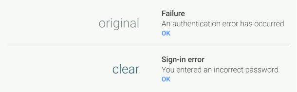
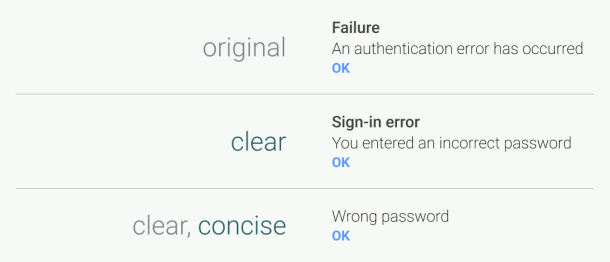
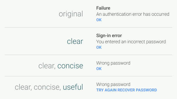
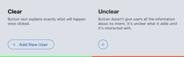
  • Microcopy should be clear, concise and helpful

  • Brand Voice serves as a guide. If there is no brand voice yet, it should be defined before the UX writing process.

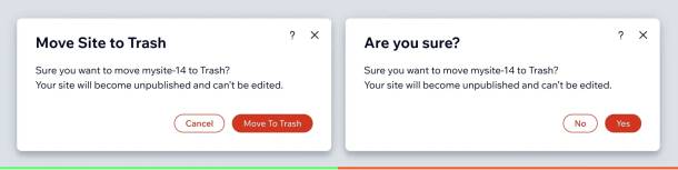
Microcopy is short, but it is often not written quickly. It requires several proofreading loops and a close exchange between UX writers and the design team to arrive at a suitable solution. As microcopy has a significant impact on the overall UX, it is important to edit it in the context of the design, as texts are read and understood differently depending on where they are placed on the screen.

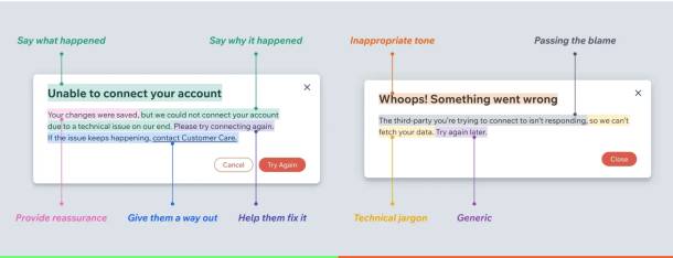
Good microcopy guides users through a digital product, offers them assistance, removes hurdles and leads them to their goal. It is clear, concise and helpful - while respecting the brand voice of the brand. It leads to a better UX, less user frustration, higher conversions and better retention. It is therefore important not to neglect UX writing throughout the conception and design process.

However, it is not necessarily possible to predict which texts will work best in digital products, even if these basic principles are "followed". The best way is to involve the target group in the development process by means of user research and testing, and to test different (text) variants.

Would you like to learn more about the topic or can you use support in the area of UX writing?

Helpful literature, blogs & talks

We just noticed that you surf with Internet Explorer. Unfortunately, our website does not look so nice with it.

You want to know why that is?
We have written about it.

Blog

You need help with the changeover?
Get in touch. We are happy to help

Contact

Install a new browser?
There's lots of choice.

Browser