
With the announcement of Apple's platform updates at WWDC 25 (here are our impressions in the story highlight), a new design language was introduced, which affects all previous operating systems. Liquid Glass is the name and part of Apple's biggest redesign since iOS 7 in 2013. Liquid Glass will fundamentally shape the user experience of operating systems and thus apps on Apple platforms.
Source: Apple, excerpt from Meet Liquid Glass
What's it all about and how will Liquid Glass affect new and existing apps?
Liquid Glass is digital, liquid glass. It has the optical properties of glass, but the reactivity of water. It allows the background to shine through and can be used flexibly with fluid animations.
The material breaks and reflects all elements placed behind it and uses realistic lighting and shaders to look like a real piece of glass. At the same time, it reacts dynamically to user interactions by enlarging, sliding, brightening and connecting with other elements. You can drag elements and, as a developer, create beautiful animations using morphing. It adjusts the color of icons or text to match a light or dark appearance and background to ensure they remain legible on the transparent material. This new look not only changes the aesthetics, but above all the functionality and user experience.
The intention behind Liquid Glass is to redefine how content and control elements interact with each other in an app. The visual separation provided by this material gives the UI new depth and leaves more space for content. It's also intended to reduce complexity and cognitive load. This puts the content of the app first. Everything is also a little rounder and detached from the edge of the screen, as the new iPhones since the iPhone X have rounded corners. This hadn't yet been fully reflected in Apple's design language. Now it has.
Dynamic navigation with Liquid Glass. Source: Apple, excerpt from Meet Liquid Glass
The inspiration and history of Liquid Glass
Where did the inspiration for Liquid Glass come from? Craig Federighi, Apple's senior vice president of software engineering, said that the biggest inspiration came from the design of Vision OS. And why a "glassy" interface?
Liquid glass has the ability to adapt, allowing the interface to integrate seamlessly into its surroundings. In the example of Vision OS, it enables the interface to become an integral part of a room. At the same time, it leaves plenty of space and feels open.
However, the idea of transparency is nothing new. Transparent elements have been around on the iPhone since iOS 7, and in 2001 Apple released the first MacOS (previously OS X or Mac OS X, not to be confused with the Classic Mac OS) with the "Aqua" design interface, which used the first transparent surfaces and reflection effects. Microsoft also experimented with transparency and glass effects under the name Windows Aero almost twenty years ago with the release of Windows Vista in early 2007. However, this operating system version was a failure for various reasons.
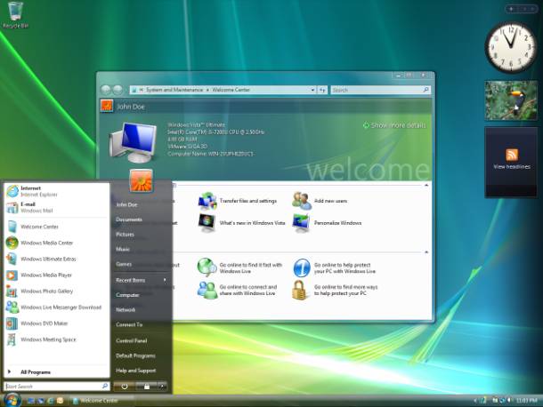
Transparency and glass effects in iOS7, macOS Aqua, and Windows Vista (Images: Apple & Wikipedia)
What changes with Liquid Glass?
The redesign gives the existing system components a completely new look. This affects sliders, toggles, alerts, panels and sidebars, among other things.
Interactive elements with Liquid Glass. Source: Apple, excerpt from Meet Liquid Glass
The navigation elements, such as toolbars, have also been redesigned. This means that these components now feature enhanced interactions and animations. Some are rounder and larger, while others are more minimalistic and compact.
Developers have access to tools for incorporating Liquid Glass material into their own components. There are design libraries from Apple and plugins for Figma. New app icons are also possible. With the App Icon Composer, icons can be created, which users can then customize with colors.
3D effects for icon lighting. Source: Apple, excerpt from Meet Liquid Glass
The before-and-after comparison
But what exactly is changing in an existing app? When modernizing our apps, we've come to the following conclusion:
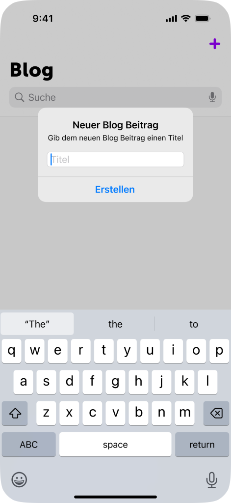
Navigation bars and toolbars have the most breaking changes. Sheets become transparent and have a higher corner radius. Background colors (such as a slightly transparent grey for darkening) can conflict with the Liquid Glass material.
Elements that were previously opaque can also become transparent. As there were additional modifications to the keyboard, unexpected UI bugs may occur. There are also conceptual changes: instead of a search field above the content, Liquid Glass requires a floating button in the context.
Why you should update your app for Liquid Glass
So, now comes the question of why this is relevant at all. Starting in September, iOS 26 and the other operating systems will be available to all Apple users (with an iPhone 11 or newer). And once the update has been installed, the Liquid Glass design will be visible throughout Apple's apps and operating systems. The iPhone and all affected interfaces will feel new and have a "fresh look".
At the same time, however, this also means that it's all the more noticeable when an app doesn't have Liquid Glass built in. Users will get used to the new interface over time and will expect the new standard of animations and minimalist design from non-Apple apps as well. For existing apps, this means in concrete terms:
Doing nothing makes an app look outdated.
If an app doesn't display modern system components in its app store screenshots or generally gives an outdated impression, interested parties can assume that the app hasn't been updated or maintained for some time. Especially for apps with a lot of competition and/or where first impressions are particularly important, this can lead to a loss of new potential customers or users. This makes it all the more important to keep up with the times and, in the case of an iOS app, with Apple, and not get left behind.
The advantages and opportunities with Liquid Glass
This brings us to the advantages that modernization brings: Apple's revised design language is intended to improve visual hierarchy and readability. The new depth, harmony and consistency with the operating system reduces cognitive load. In addition, the glass effect makes the space taken up by control elements appear smaller. This leads to faster information processing, better consistency with the operating system and familiarity.
Source: Apple, excerpt from Meet Liquid Glass
A visual update also signals active maintenance. Even without technical revisions, a fresh design conveys an impression of modernity and up-to-dateness. This provides a simple and relatively inexpensive method of refreshing and revising the perception of the app and company without making major adjustments to features and functions.
With the design changes at Apple and Google (with Material 3 Expressive), users may also expect a redesign. Since Android and Apple have released new native interfaces and design languages at the same time, it will be even more noticeable to users if an app hasn't been adapted.
A design update is also the perfect opportunity to critically examine the entire user experience and optimize the existing design. You could reduce the so-called design debt and at the same time bring dependencies up to date.
This visual leap not only makes it easier to use, but also conveys a sense of familiarity and quality, as an app interacts seamlessly with the user experience of Apple's operating system. The result: improved user experience, higher user satisfaction and potentially better App Store ratings.
The challenges posed by liquid glass
Every change brings challenges with it. The first is, of course, that change is happening at all. This change means that users, developers, design teams and stakeholders in general have to adapt. This takes time.
As this is a comprehensive redesign of an operating system that hasn't changed significantly for a long time, it has also been criticized by some Apple users. Fortunately, Apple is aware of this and is giving developers until the end of Q1 2026 to adapt their apps to Apple's design principles. This will also allow users to get used to the new design.
Another challenge is to reflect your own corporate identity (corporate identity and corporate design, CICD) despite iOS Native UI components. However, changes can also help. This is because the Liquid Glass material makes it possible to focus more on the actual content and specific stylistic elements, thereby clearly communicating the corporate identity.
As mentioned above, not everyone is a fan of the new look. However, we believe that most users will adapt and quickly get used to Liquid Glass. Apple has also already responded to feedback: the frosting of the transparent material, i.e. the blurring, has been increased across several beta versions. In addition, Apple has made it possible from the outset to significantly reduce the transparency of the material in the settings.
What happens when transparency is reduced and contrast is increased. Source: Apple, excerpt from Meet Liquid Glass
Deadlines and necessary adjustments
iOS 26 is expected to be officially released in mid-September 2025. From that point on, the update will be available for installation on all Apple devices that have a chip equivalent to that of an iPhone 11 or newer. Users with a compatible device will then be able to take advantage of the latest features and improvements to the operating system.
A few days before the official release of iOS 26, App Store submissions for iOS 26 builds are expected to be approved. This means that we and other developers will be able to adapt apps to the new design and features of iOS 26 and submit these updates for review in the App Store so that they're ready in time for release. This isn't yet mandatory, but by next spring at the latest, new builds will have to be created with the iOS 26 Software Development Kit (SDK).
Preview of Apple's new design language and icons. Source: Apple, excerpt from Meet Liquid Glass
What options for action are available?
Option A: The app is left as it's, no update is made.
System components that haven't been adapted or modified during development, such as alerts, date pickers and toolbars, automatically take on a new look. If not everything is your own creation, this can result in a mixed design. This means that homemade elements can quickly stand out negatively and the difference becomes more visible. The new/different expectations of UI and UX are also not met.
If an app runs on an iPad, there are also changes here. With the new Window Mode on iPadOS, apps can be opened on the iPad in different sizes and aspect ratios. As we've discovered ourselves, this can lead to problems. We therefore recommend testing apps on an iPad as well – we do this for our customers' apps anyway, of course.
Option B: A new build is created with the iOS 26 SDK and bugs are fixed with minimal effort.
Most system components are adapted through a new build with the latest SDK. This can lead to a few bugs. Apple has made many changes, especially to navigation. This usually requires a few bug fixes to get the app running again with the usual quality. It's also a good opportunity to update the app icon with the new Icon Composer and refresh the App Store screenshots. This gives the app a modern touch right from the start.
Option C: Targeted adjustments for the new design
The new design language and UX changes are a good opportunity to take a closer look at the app. Building on Option B, elements can be overlaid with the glass effect and principles such as "content first" can be applied throughout. Beautiful animations and adaptive designs with Apple interfaces give the app a modern and high-quality look. This update can also be perfectly combined with a new market presence in the App Store.
Regarding option A, it's important to note that updating to Apple's latest SDK isn't optional. Sooner or later, new builds for the App Store won't be able to be built with older SDKs. This means that from spring 2026 onwards, developers and companies will be forced to update their apps to iOS 26 as soon as they want to implement a new feature or fix a bug.
We therefore recommend addressing these potential future problems as early as possible. As urgent changes and hotfixes may be required for a productive app, there may not be time to fix bugs in the new design.
By the way: Naming is difficult
Instead of continuing with iOS 19, all operating systems will now be labelled with the calendar year in which the operating system is most widely used. This means that iOS 19 will become iOS 26, as it will be the latest OS for the iPhone from September 2025 to September 2026.
Well equipped for the future
Our customers who have a service contract with us for their app are prepared: our service includes annual regression testing with the beta versions of the relevant operating systems. This year, we've again created new test builds for all affected iOS apps and will then offer our customers the appropriate option for an update.
If you're unsure how your app for iPhone, iPad, MacOS, Apple Watch, Vision Pro or even tvOS – all Apple platforms and systems of the 26th generation are switching to the Liquid Glass design language – will be affected: We're familiar with the Apple ecosystem and have already been involved in many design trends. We're happy to help and can offer simple advice in a personal consultation, but we can also refresh designs and implement them technically. Feel free to contact us via info@appswithlove.com, on 031 333 01 51, or drop by for a coffee!