Editor's note: Accessibility in digital products is obviously an important topic and one we at Apps with love try to take into consideration as much as possible when developing software for our customers. Recently we were involved in a project to update an app that will not «only» have to comply with WCAG standards but also with particular requirements for the American market.
Magdalena Nuckowska, software tester at our long-standing partner Sagiton, was involved in the process of testing said app. In the following blogpost she sheds light on the complexity of accessibility testing and shares her most important learnings from that project and her expert-insights generally when it comes to testing accessibility.
Should the design and development of an app comply with accessibility guidelines and standards? For Apps with love this is a no brainer - ensuring that the application can be used by individuals with different abilities is a vital characteristic of any digital product. Making an app accessible is not only an ethical and in many cases a legal obligation, but may also influence social and economic dimensions.
In this article you will learn what the most common accessibility regulations are and what steps the quality assurance (QA) team at Apps with love together with their partners worked out, in order to evaluate a digital product against accessibility criteria. Moreover, you will read about compliance benefits, as well as challenges you can encounter in the QA process. To better illustrate the topic we also included useful tips based on a specific project example.
Regulations, standards and rules
Accessible design and development of applications should go beyond simple compliance with regulations - it is about delivering an extraordinary user experience. The point is to create and deliver an inclusive product which offers great intuitiveness, remarkable but logical navigation as well as a consistent and attractive interface to all users.
Nevertheless, when thinking of an application’s design, development or testing, of course we have to consider the basics which are laws and standards. When it comes to accessibility the most common standards and laws are:
The Web Content Accessibility Guidelines WCAG (current version: 2.2.) published by the Web Accessibility Initiative (WAI) of the World Wide Web Consortium (W3C). The WCAG are the most widely recognized standards in most parts of the world.
The Americans with Disabilities Act (ADA): A federal civil rights law implemented in the United States of America in 1990 to prohibit discrimination against people with disabilities in everyday activities.
Section 508 of the Rehabilitation Act in the USA: A federal law that requires agencies to provide individuals with disabilities equal access to electronic information and data comparable to those who do not have disabilities, unless an undue burden would be imposed on the agency.
In Switzerland, complying with the accessibility standard eCH-0059 (eCH-0059 Version 3.0 to be exact) which is based on WCAG 2.1 is mandatory for all governmental information and services that are available digitally. This is founded on article 8 paragraph 2 of the Federal Constitution which stipulates non-discrimination against people with a physical, mental or psychological disability.
More about the accessibility basics, laws, regulations and standards you can find in a previous blog article about accessibility. This article focuses more on the practical aspects of testing against WCAG and US-regulations, mainly because we recently had the experience of testing the FELFEL app with regards to these regulations as they are entering the US Market.
Testing against WCAG, ADA and Section 508
Depending on the application’s target market, audience and location or residence of the company who has ownership of the application, it might be necessary to assure compliance with one or more accessibility regulations. The most important characteristics of mentioned regulations are presented in the table below.
| WCAG | ADA | Section 508 | |
|---|---|---|---|
| Framework | International Standard | US Federal Law | US Federal Law |
| Applicability | Global | US Specific Title I: Private Entities Employment Title II: Public Services and Local Government Title III: Private Entities Public Accommodations and Services |
US Federal Agencies and Contractors |
| Development Authority | World Wide Web Consortium (W3C) | United States Congress | US Access Board |
| Conformance Levels | WCAG A, AA, AAA | Partially WCAG A, AA | WCAG A, AA |
| Scope | All Digital Content | Public Accommodations, Employers | Federal Information and Communication Technology (ICT) |
Source: WCAG vs. ADA vs. Section 508
Summing up, the WCAG regulation is applicable to all digital products around the globe, whereas the ADA and Section 508 are valid for the US. Additionally, WCAG is applicable to apps of all sectors and audiences, ADA is dedicated to the private sector and some areas of the public one, while Section 508 only applies to federal agencies and their contractors. These regulations differ in the matter of the primary focus. WCAG applies to all digital content, including websites, applications and documents. ADA focuses on establishing non-discrimination rules for public accommodations, employers and businesses. Section 508 requires federal agencies to provide users with disabilities equal access to electronic information and data comparable to those who do not have disabilities.
It is worth mentioning that currently Section 508 is based on the WCAG standard levels A and AA. After the update in April 2024 also the ADA Title II states that websites, apps, kiosks, mobile apps, and digital content must be compliant with WCAG 2.1, Level AA.
The WCAG standard is the most widely used and has a lot of overlap with region-specific regulations such as the American ADA or the Swiss eCH-0059. That is why the remainder of this article is focused on describing accessibility in the context of this particular standard.
Testing the accessibility of digital products
When you want to test whether a digital product meets the accessibility criteria, the question often arises: How should you start? The process can be complex and varies depending on the product, the stakeholder’s expectations, time and budget. At Apps with love we made the experience that it is worth proceeding with the following steps:
Defining requirements: Decide which law/regulation is the one applicable for your application and to which extent the product should meet the corresponding requirements. For example, which level of the WCAG is the point of reference. While in some cases this is defined by regulations, in other cases these requirements can be defined by the product owner or derived from the consultation of all stakeholders.
Testing: Verify whether the app meets the chosen requirements. This step often requires a lot of exchange between both the development team as well as the product owner.
Consultation between QAs: The complexity of accessibility issues may require deeper analysis and views from different perspectives, which can be achieved by engaging more than one pair of eyes in the testing process.
Consultation with designers and developers: Some accessibility requirements cannot be tested solely on the frontend side of an app. The insight from the design and code perspective is crucial to assess whether some criteria are met or not.
Conclusions and reporting: Sum up the test results, so they can be presented clearly: which requirements have been met fully, partially or not at all. This step can be finished with creating a list of recommendations for the app, so the discrepancies can be fixed or addressed in the future
Consultation and decision-making: Analyze the conclusions and decide on the possible improvement plan for the app - usually in the form of an exchange between the product owners and project management.
Accessibility testing guidelines
Since we at Apps with love have tested the accessibility of a few digital products we have our fair share of experience, which allowed us to come up with some helpful tips:
Determine your application’s basic characteristics
Operating systems: Accessibility solutions can differ between, for instance, Android and iOS - assistive apps, as well as accessibility testing tools might be available only for a specific platform or limited (newest) system versions
Desktop vs. mobile application: This will strongly influence the methods and techniques of testing because it determines the use of operating systems, screen sizes, possible assistive technologies, assistive devices, screen navigations etc. Because of that, some of the accessibility criteria will be passed on desktop, but not on the mobile app and vice versa.
Web vs. native application: Determines issues such as possible assistive technologies or screen navigations. For example some of the navigation solutions might be available for one mobile platfrorm for a native app, but not the other. It might also influence the issue of coherence of the app between different OS platforms.
Devices the app will be used on: Among others this determines screen sizes and assistive technologies (for example: can the device be connected to Bluetooth or a USB-based keyboard)
Audience of your app: The product, its compatibility with assistive technologies, navigation etc. have to be adjusted to the needs of the target users, taking into account different disability types
Goal of the app: The key functionalities of the product impact the ways users interact with the app. Analyzing user scenarios can provide knowledge on possible soft spots and needs of extra support for the user
Testing accessibility requires answering these fundamental questions, because they determine the whole testing process. Some of the requirements are designed in a way that they apply only to some types of applications and are not relevant for others.
Know your requirements
Going to the official source of information on the chosen requirements is always a good idea. But that might be merely the beginning. Reading specific criteria might not give you enough insight to straightforwardly apply them in the testing process. Depending on the complexity of the requirements a QA might need additional support to correctly interpret and apply them in the testing process. There are different sources of practical knowledge such as accessibility requirements interpretations and examples which might immensely help to understand the accessibility criteria thoroughly.
Such examples and extensive explanation can be found on the W3C website. For criterion 1.3.4 «Orientation» for example, the following information is provided:
Definition: Content does not restrict its view and operation to a single display orientation, such as portrait or landscape, unless a specific display orientation is essential.
More in depth explanation of the criterion including its goal (devices can be used in any orientation), what to do (don't lock content to either portrait or landscape presentation) and what is important (wheelchair users and others may have devices mounted in a fixed orientation).
Furthermore it includes the definition of the criterion’s intention, benefits (users with low-vision will be able to view content in the orientation that works best for them, for example to increase the text size by viewing content in landscape format), examples of implementation (an eReader web app can display the contents of a book in both portrait and landscape orientation) and test rules.
A separate link leades you to a site with examples with successful and failed cases of implementing this criterion.
We included more sites that provide insights to accessibility criteria at the end of this article.
Ask for a second opinion
There is a saying (it may or may not have come from Confucius): «The man who asks a question is a fool for a minute, the man who does not ask is a fool for life.» This is particularly true when it comes to the quality assurance process of a digital product and critical when testing its compliance with accessibility criteria. The complexity and universal nature of the regulations might often leave a tester uncertain whether an app fulfills the specific criterion or whether the requirement is even relevant or applicable to the product in question.
Some of the accessibility aspects will be better known to a designer or a developer because they were integrated in the app early on in the development process and are sometimes hard to spot from a black box perspective (looking just at the app’s interface and not it’s code). Of course you can never go wrong with exchanging with other QAs. Each individual might understand the requirement in a slightly different way. That can result in a diverse assessment of whether the criterion has been met by the app. Establishing a common understanding of specific requirements by different testers might vastly improve the quality of test results.
Of course, the best way of testing a digital product for accessibility is to consult with users who are actually dependent on accessibility requirements being implemented correctly.
Try different testing settings
Certainly not breaking news, but still worth mentioning is that it is important to change the testing settings during assessing the accessibility aspects of a product. Using different devices, operating systems, assistive technologies or resolutions will definitely give a wider overview on the application and its behavior in different environments. You can avoid a «It works on my device» (but not on others) type of situation. Not to mention that colors, resolutions, contrasts, graphics and all the other visual elements might look radically different on different devices.
Challenges and benefits of accessibility testing
It is good if the QA team is aware of different accessibility testing challenges and risks, so they can be taken into account in the planning process. Those can include:
Universal character of the requirements
WCAG requirements apply to all kinds of digital products and sectors, desktop, mobile, web and native, as well as diverse audiences: general public, but also specific/narrow groups.
So when testing against criteria regarding for example highlighting sections of the screen, using shortcuts/special keys like «tab», swiping, sequence of gestures, the QA has to decide if the requirement is valid and applicable to the given product.
Differences between platforms and devices
Android and iOS devices differ in terms of accessibility solutions, assistive technologies, and debugging possibilities. That might cause issues in implementing matching accessibility solutions, and also in preserving consistency in the user experience between different devices and systems.
Requirements difficult to verify on the frontend
Some of the requirements are impossible or tough to test from a frontend-only perspective. That includes for example WCAG-criteria such as:
Identify Input Purpose: The purpose of each input field collecting information about the user can be programmatically determined under certain conditions (WCAG 2.2, §1.3.5)
Name, Role, Value: For all user interface components (including but not limited to: form elements, links and components generated by scripts), the name and role can be programmatically determined. States, properties, and values that can be set by the user can be set programmatically and notification of changes to these items is available to user agents, including assistive technologies (WCAG 2.2. §4.1.2.).
Business vs. accessibility requirements
The design, the purpose or some business aspects of an application do not always go along with the accessibility requirements. Often colors, fonts, sizes, screen orientation and lots of other visual elements are a part of the brands communication and marketing strategy. Should they be altered so the app can meet accessibility criteria? That is another hard nut to crack.
So an important question arises: is implementing good accessibility worth it? Well, there is no doubt that making the app compliant with accessibility requirements is important on many different levels and can benefit the product, brand and business in a variety of ways - even if there is no binding regulation in every case to do so.
Gathering a broader audience - a more user friendly and inclusive app attracts a bigger audience which can translate into potentially greater market coverage and profit.
Increasing brand loyalty - accessibility allows people with disabilities to interact and participate in the digital landscape, which makes the product more likable. It shows dedication to diversity, equity, and inclusion (DEI).
Improving general user experience - improving ease of use, navigation, comprehension, and interaction can make the user experience more satisfactory for all users, not only the ones with disabilities
Search Engine Optimization - aligning with the accessibility requirements might improve a digital product’s visibility to search engines, and thus expand the audience reach
AI optimization - AI-driven platforms like Bing and ChatGPT currently gain in popularity against the traditional search engines. Implementation of accessibility requirements in the digital product may well serve the Artificial Intelligence Optimization (limiting access barriers contributes to the functioning of these platforms).
Those aspects translate directly to the additional business gains such as wider market reach, bigger audience, better user satisfaction and loyalty, elevated brand value and recognition and as a result potentially higher profit.
Accessibility in the FELFEL app - a practical example
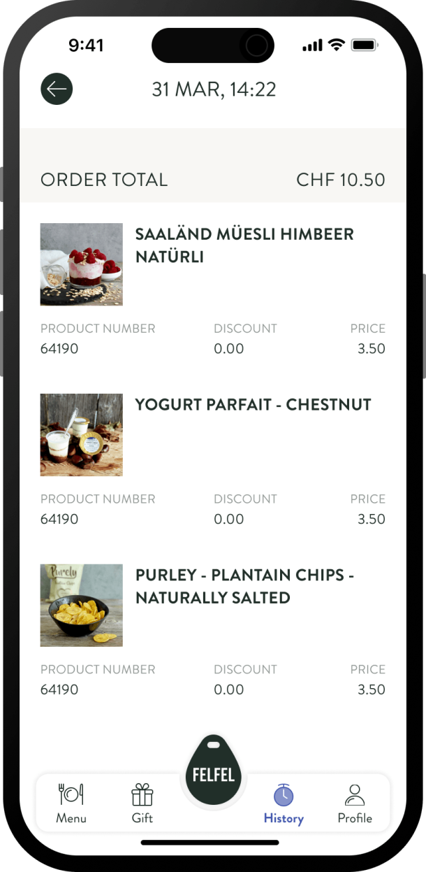
Benefits of accessibility compliance are valued by a number of companies, including our Apps with love’s customer FELFEL, who’s app we’ve been developing and maintaining for a few years now.
FELFEL is Switzerland's popular employee catering and office coffee solution.
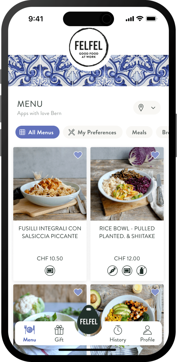
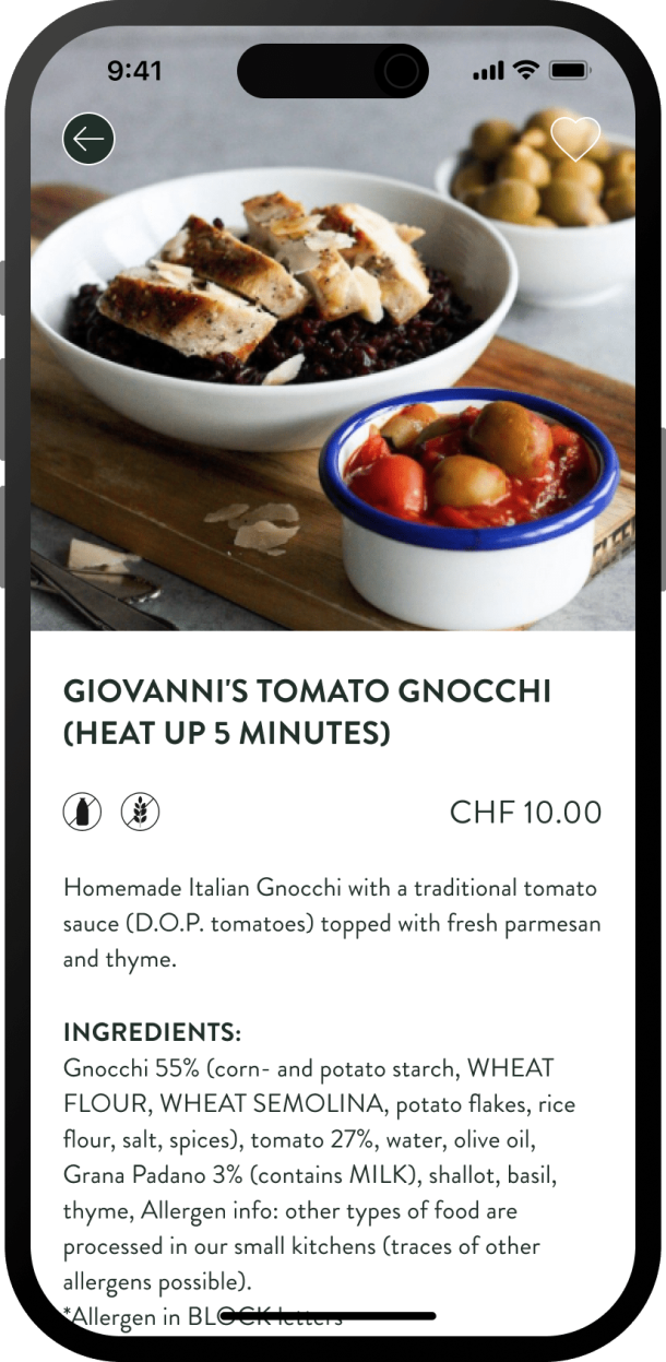
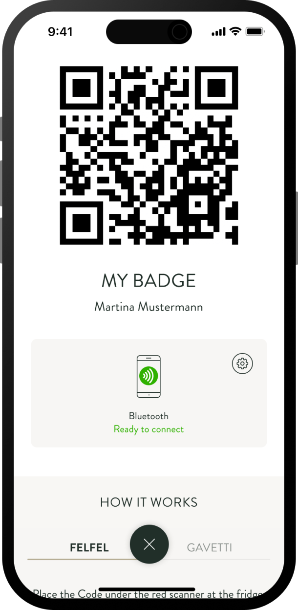
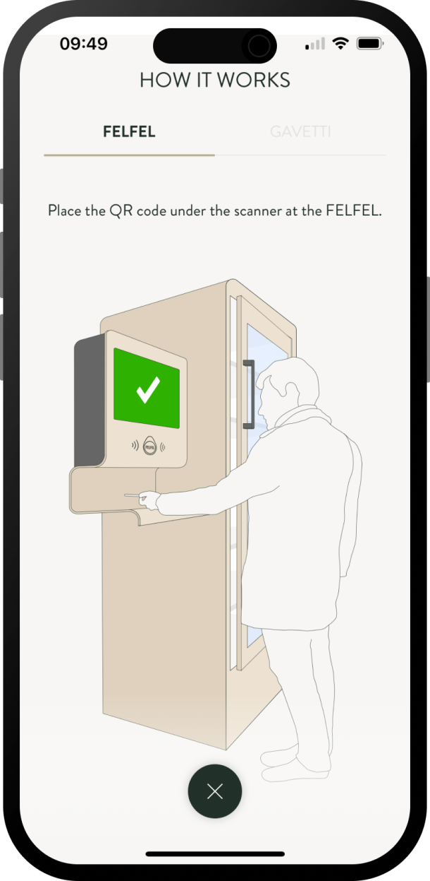
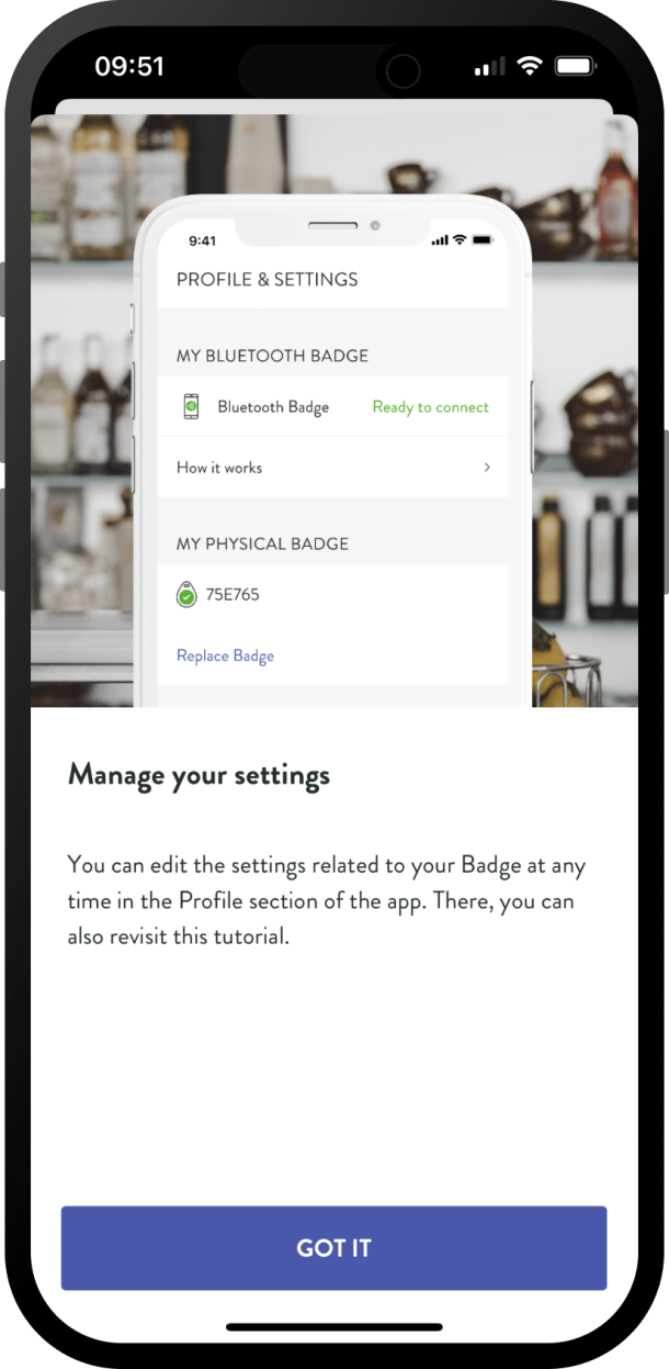
The app enables users to browse the available menu, open the FELFEL fridge and select a dish of their preference and to pay for it.
In order to make the app more inclusive and user friendly, the product owners at FELFEL decided to make sure it complies with the accessibility standards of WCAG 2.1. level AA.
However that was not all: Since the company is expanding and recently entered the US market, they also had to ensure compliance with the ADA.
Our team’s goal was to test the mobile version of the application on two platforms: Android and iOS against the accessibility criteria of WCAG as well as ADA.
While testing the FELFEL app for the corresponding criteria, a few doubts and questions regarding specific requirements came up.
| WCAG Requirement | Question regarding the requirement |
|---|---|
| Video-only files (1.2.1) Either an alternative for time-based media or an audio track is provided that presents equivalent information for prerecorded video-only content. |
There is an onboarding instruction in the form of an animation - should it contain an alternative explanation in text form? |
| Orientation (1.4.1) Content does not restrict its view and operation to a single display orientation, such as portrait or landscape, unless a specific display orientation is essential. |
Should the app be available in both orientations (landscape and portrait) if it’s against the original idea/visual purpose? |
| Images of text (1.4.5) If the technologies being used can achieve the visual presentation, text is used to convey information rather than images of text except for the following: - The image of text can be visually customized to the user's requirements; - A particular presentation of text is essential to the information being conveyed. |
Can images of text be used if they serve a specific purpose like an onboarding instruction? |
| Non-text content (1.1.1) All non-text content that is presented to the user has a text alternative that serves the equivalent purpose, except for the situations listed in the criterion. |
Can all toggle buttons have the same alt-text as on/off? |
Source: https://www.w3.org/TR/WCAG22/
Additionally, the accessibility solutions seemed to work differently on different operating systems. This included criteria like contrast, resizing, pointer cancellation and alt-text coverage.
Evaluating the FELFEL app gave us a better insight into how accessibility can be integrated in the digital product and also opened our eyes to some learnings such as:
Taking into account that each OS/platform might need different time and resources to be tested properly
Planning the testing process with the assumption that extra time might be needed
Using requirements interpretations and our internal accessibility knowledge base helps immensely to assure the application’s compliance with regulations, as well as to improve the product’s quality
Periodic updates of the team on the matter of accessibility helps to design and build higher quality applications, that go through the assessment process easier and quicker.
Accessibility as a highlight?
Testing compatibility of an application with the accessibility requirements can be a long and challenging process. The amount of regulations, their complexity and variety might be overwhelming at the beginning. And the real struggle comes with actual verification of the app’s elements against the specific success criteria. However, with the experience of going through the process, comes also the expertise.
The Apps with love team is committed not only to be up to date with the accessibility regulations but also apply them in practice, starting with the design, throughout the development process and ending at quality assurance. It is in our own and our clients best interest to create inclusive, user-friendly and intuitive apps based on innovative technologies. Therefore, it might be beneficial to think of accessibility solutions not as imposed features, but as highlights of a digital product. All in all, applying them may bring a spectrum of benefits and substantially raise the value of an application.
Help for accessibility design, development and testing
Here are some useful tools and links where you can easily find useful tips, interpretations and information on accessibility matters:
Testing help for Android: Accessibility Scanner
Testing on mobile: use screen readers for testing alt-text and non-text content, design tools such as Zeplin or Figma to assess colors and contrast.
About Magdalena
Magdalena, better known as Magda, is a software tester at our long-standing partner Sagiton. She puts our developments through their paces and knows how to report back any bugs clearly but diplomatically - perhaps this skill can be attributed to her Master’s degree in International Relations & Affairs.
Magda dreams of a Lord of the Rings x Harry Potter Fusion (Gandalf and Dumbledore could be brothers after all) and against popular opinion thinks Nutella is overrated.

