Without a light in the bright net - why accessibility is important and what to consider

07. April 2021 - from Maya Walther


Inclusion means access for all to everything. Since we, at Apps with love, put the end user at the centre, it is important to us that we also think about the large number of end users, who have a visual impairment. All too often, apps and websites are developed that are difficult or impossible to use for these people.
We met Marcel Roesch and developed the accessible website "help2type" with him. There, a haptically tactile keyboard for smartphones is offered - a very practical tool for the visually impaired.
In the following blog post, Marcel talks about what it's like to be on the Internet with a visual impairment and what needs to be considered in software development with regard to digital accessibility. To ensure that your software is accessible for everyone in the future, we provide you with the most important sources of information on the topic of accessibility.


Marcel's insight into the beautiful and annoying experiences of the digital world

Imagine that your world of senses is reduced by 80%. This is exactly what happens when you are blind. Thanks to the internet, you still have many options open to you. You can shop alone, consume information and communicate.
That is freedom. But it only works if you think about it during planning and implementation. A light switch is only useful if it can be switched on or if the necessary aids are available to switch it on.

According to a study by the Swiss Central Association for the Blind, around 377,000 people with a visual impairment, blindness or hearing impairment live in Switzerland. Worldwide, this number can be supplemented with approximately three zeros. That is more than 4 percent of the total population. It is definitely worthwhile to consider this target group in the digital world. In software development, the topic of "accessibility" should be given the appropriate priority.

In order to use computers, the internet, smartphones and apps, I rely on a screen reader and responsible programmers. The screen reader software reads to me what has been defined as the screen display in the backend. So if the programmers have done a good job, the links are named according to what they trigger (for example, a product description), images according to what they depict (man with glasses) and buttons in apps are labelled according to function (back, menu, share, etc.). If this is not done correctly, the link may be called abrklwpyiejröy*890s2, pictures are called Grafic2754 and buttons in apps are very creatively called "button".

In the beginning, I always need a lot of time to understand a new page: Are the titles set correctly? Can I jump directly to form fields? Is all the information read out to me? As soon as I know a page, I can navigate quickly and purposefully with countless key combinations. However, this requires that the accessibility requirements are also met. 


E-Commerce: Shopping experience with obstacles

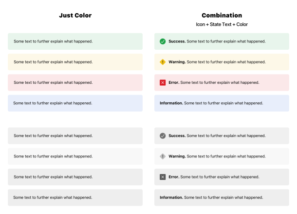
It's really bad when I struggle for ages through a page, finally have the product I want in the shopping basket, and at the end I can't select the payment option, for example. The killer is visual CAPTCHAs that offer no voice output, commonly known as "audio description". All visual effects are hidden from me. It is of no use if an order button appears big, bold and flashing. If it is not correctly defined, the screen reader software will not find it.

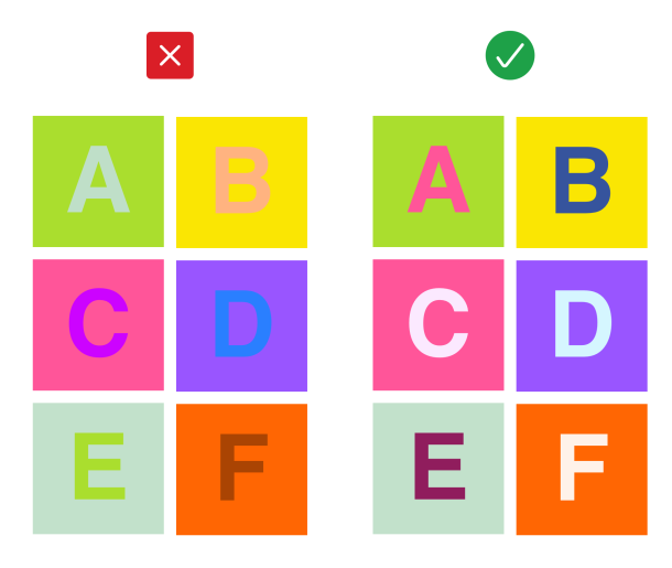
Visual features are irrelevant for visually impaired and blind people. Colors, sizes, effects etc. are only of limited help. Nevertheless, there also are sighted users. Two groups of needs have to be taken into account and coordinated. This is challenging and must be planned for from the very beginning of a project. If the requirements of different target groups are only taken into account at the end of the project, it will logically be time-consuming. This applies to all target groups, but especially when it comes to the accessibility of a digital solution. Hence, the unfortunately widespread opinion that accessibility is expensive. This is not necessarily the case. If the needs of all users are taken into account from the very beginning in the concept, design and development, the additional effort is manageable.


When it comes to visual features, certain principles must be observed. Content must also be easy to read and understand for people who are not visually impaired.

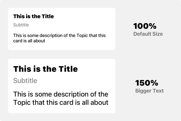
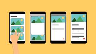
  • Dynamic font sizes: there is no such thing as the "right" font size. It is clear that the font size must adapt to the output medium. However, the users of these output media must not be forgotten. People have different levels of vision, so it is difficult to make one font size fit all. The solution to this problem is dynamic font sizes that make it possible for users to determine their own preferred font size.

Dynamische Schriftgrössen
  • Color contrasts: Here, it is important to pay attention to good contrast ratios - if the color contrasts are too deep, differences are difficult to perceive. Certain complementary colors are also indistinguishable for some people (red-green blindness). Color contrasts can be calculated - tools such as the Contrast Checker help with this.

Schlechte vs. optimierte Farbkontraste
  • Combination of color, text and icons: Important information should not only be based on colors. Additional information and in the form of text and icons helps make the communication clearer and easier to understand.    

Kombination Farbe, Icon und Text

Being able to communicate

To be able to communicate in the digital space, we need to be able to write. A touch keyboard is hardly operable for the visually impaired. That's why I developed the world's first mobile keyboard for smartphones. The help2type haptic keyboard is compact and can be attached directly to any smartphone. It is connected via Bluetooth and works with iOS and Android. Sure, there is also the dictation function today, but who wants to dictate business messages, this blog here, confessions of love or passwords in public?

Thanks to help2type, it is possible to communicate in writing and belong.

Interestingly, with the help2type keyboard, we can make not only visually impaired people happy, but also older people. Because the keys are haptic, typing is easier for them. They can communicate again in club chats or send messages to their grandchildren:

Success factors for a highly accessible website or native app

The success factors for accessibility lie in good planning, thinking designers and programmers and open communication. My experience with Apps with love was excellent in this respect. As an client concerned, I was able to contribute my needs and Apps with love briefed their programmers accordingly. Nevertheless, during the development of the help2type website, we stumbled over one or two tricky features. For example, it turned out that many people who depend on a screen reader still surf with Internet Explorer. This is despite the fact that IE as a browser is a discontinued model. For screen reader software, however, it works more reliably than other browsers. Therefore, support for this browser had to be guaranteed, of course. So it takes mutual willingness to develop together and to keep an eye on the result. We have done that successfully.

It is important to note that there are different levels of accessibility. I can only speak as a user in the field of blind and visually impaired people. For example, there also are people, who cannot read - their needs should also be met and covered. Taking these requirements into account as early as possible in the planning process is the key to success.
If I may make a request to project managers and programmers: Please name things after what they are. "Button", "Grafic3041" and "xliwlerlink" are not very user-friendly.

There's one thing we must all remember: If the Internet didn't exist, the possibilities would be a lot less. I would have to rely on someone to read everything out to me. So it's important to keep your nerve and accept when something isn't solved perfectly - even if I often get terribly upset myself :-). It's better to be able to enter a world at all and sometimes search in the dark than to have no options at all. 

Marcel Roesch

"There is always a way, together we can do it. Let there be "light"."

Marcel Roesch is head of Swisscom's internal film team. There, he is a storyteller and trains apprentices. He has been almost blind since early childhood and can only recognise shadows. Composing messages on a smartphone is therefore a challenge and takes a long time. Since he did not find existing solutions for visually impaired people practical, he developed his own haptic mobile phone keypad without further ado as part of "Kickbox", Swisscom's internal support programme and with the support of Creaholic and other investors.

Where can I find out about the applicable and recommended guidelines?

The "Web Content Accessibility Guidelines" are an international standard for the designing of accessible websites. The guidelines were developed by the Web Accessibility Initiative of the World Wide Web Consortium (W3C), the body for standardizing techniques and technologies on the web.

These guidelines naturally go beyond the specific needs of visually impaired people and also take into account, for example, deafness, movement restrictions or light sensitivity.

Roughly, the WCAG are divided into four principles. Web content must be perceptible, usable, understandable and robust. There are defined success criteria for each principle, which in turn are divided into three levels - depending on the priority of the requirement.

  • Level A: Basic requirement and highest priority

  • Level AA: Medium priority requirements

  • Level AAA: Additional requirement, low priority

The WCAG as the overarching reference of accessibility standards are very comprehensive. They contain a multitude of recommendations that would go far beyond the scope of this blog post. We therefore refrain from trying to summarize the "most important" points here, but rather provide you with the most important sources.


Where can I get help?

Those, who do not have the capacity to study the guidelines themselves and to check whether a developed solution meets the standards, can of course seek help from various bodies. For example, the "Access for All" foundation offers assessments and audits on the topic of accessibility. In these audits, digital solutions are checked by experts for digital accessibility, based on the WCAG.

In addition to these services, "Access for All" also provides important information and practical checklists and offers courses and certification.

We think this is a good and above all important cause, which is why we support the foundation as a patron.

Here, you can also become a patron!

We would like to take this opportunity to express our sincere thanks to Marcel Roesch: For the uncomplicated cooperation, the trust placed in us and the always upbeat manner - Thank you!

We just noticed that you surf with Internet Explorer. Unfortunately, our website does not look so nice with it.

You want to know why that is?
We have written about it.

Blog

You need help with the changeover?
Get in touch. We are happy to help

Contact

Install a new browser?
There's lots of choice.

Browser