Hörminute

Listening consciously
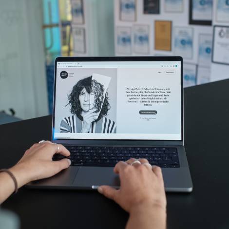
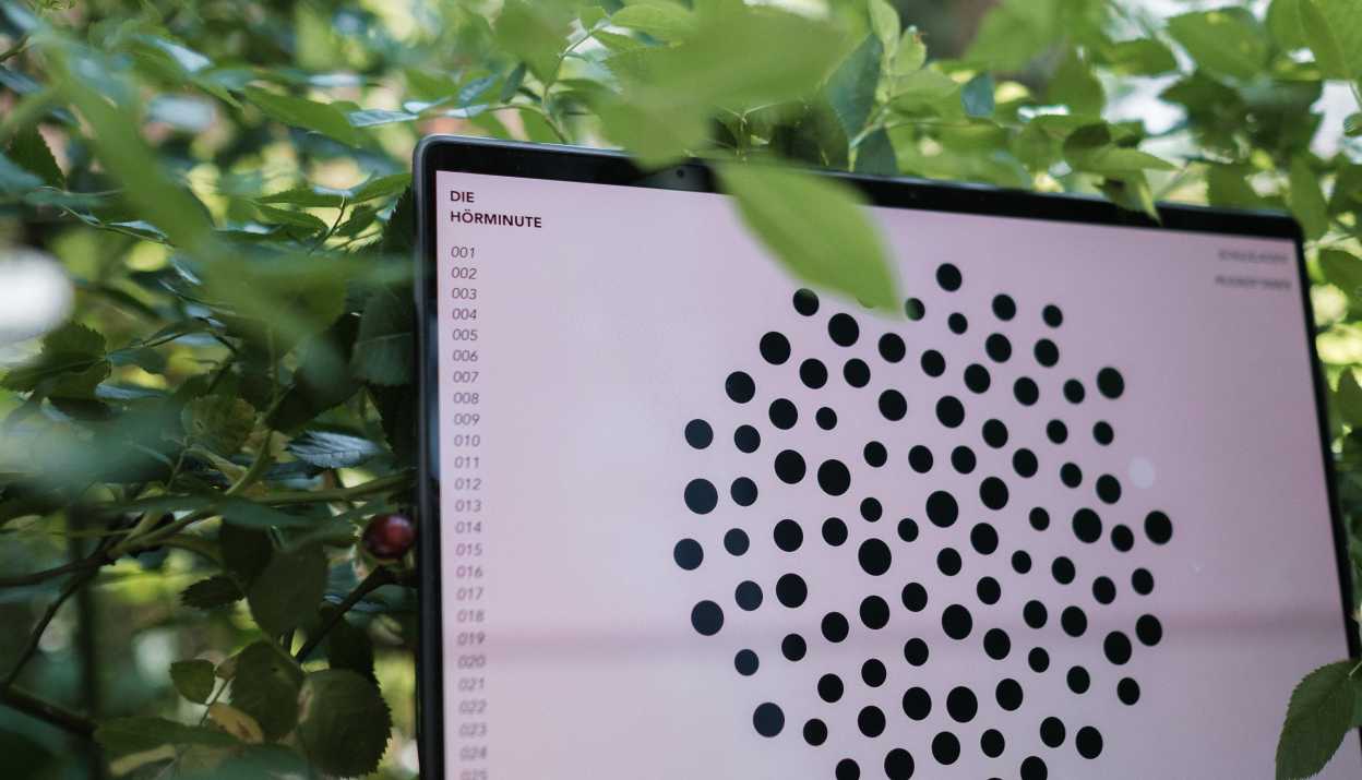
We designed and developed a minimalist web platform for Zuhören Schweiz that is all about listening. The "Hörminute" invites you to experience moments of active listening through a collection of sound experiences.
Client
Zuhören Schweiz
Year
2023
Categories
Concept and design, Web development, Projektmanagement
Links
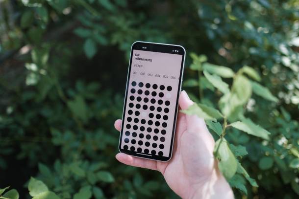
Mobile View of Hörminute

Soundscapes on the Internet?

When the association Zuhören Schweiz approached us in January with the idea for the Hörminute project, we were gripped by curiosity: first of all, curiosity about the association itself and its purpose. An organisation that focuses on listening? Exciting stuff. And then, of course, curiosity about the challenge: in the vast majority of cases, digital media is first and foremost a visual experience: images, text, video. Of course, sound and tone are also part of it, but how do you put the auditory experience of sounds at the centre?
Finding solutions in the workshop

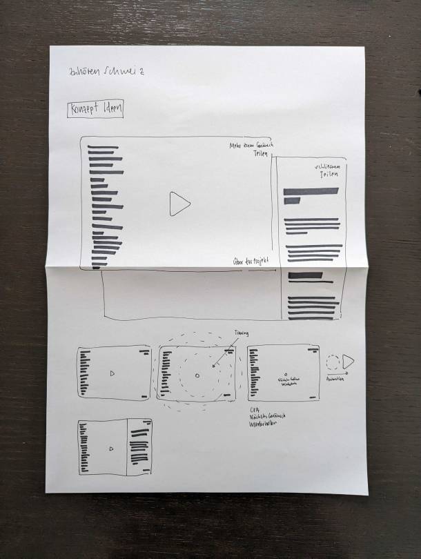
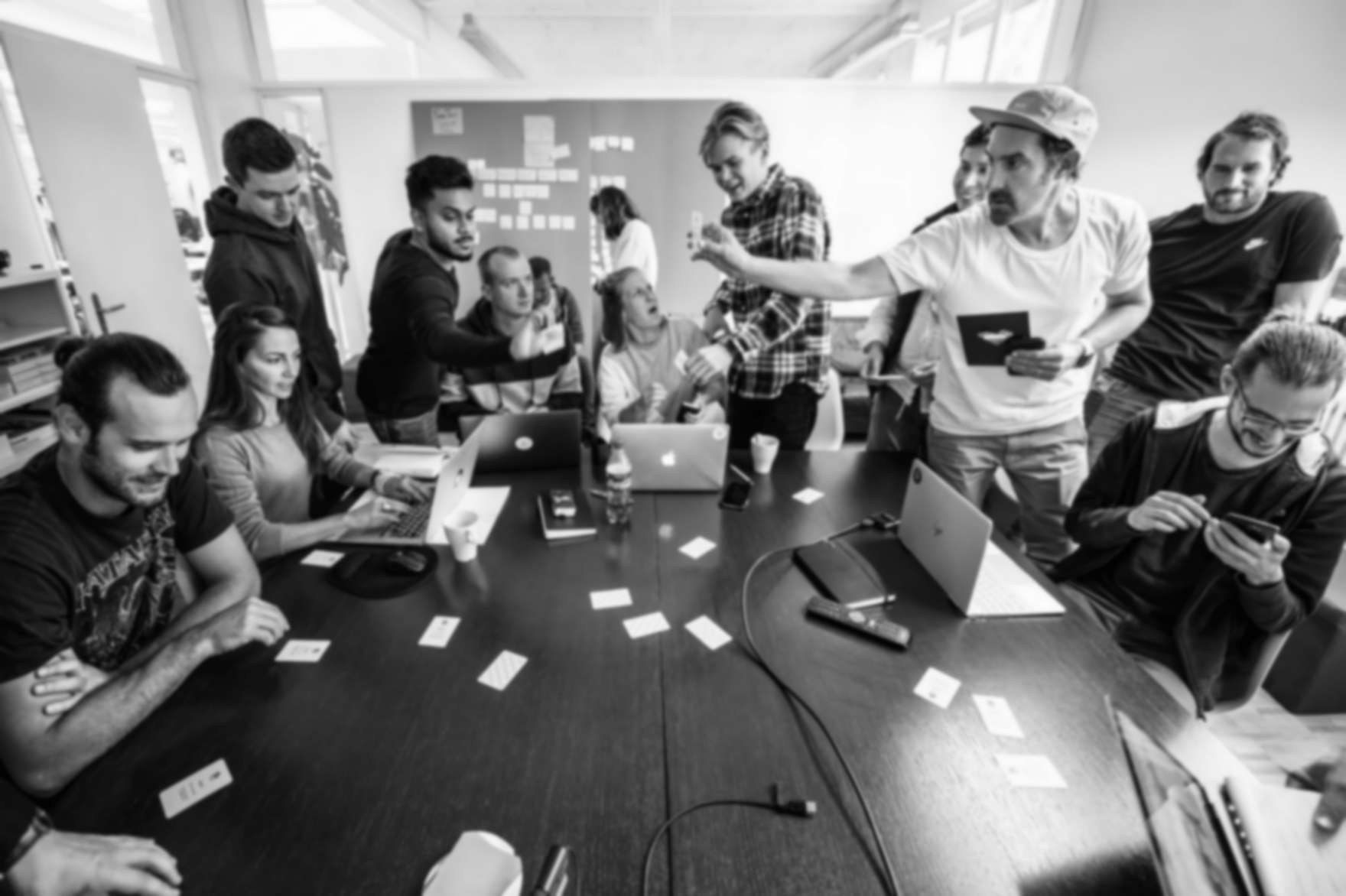
As with most projects, the first step was a joint workshop. As this was a small cultural project with a limited budget, it was all the more important to prepare this workshop well and to start with concrete ideas in order to make efficient progress. During the preparation phase, we analysed the information provided by Zuhören Schweiz. On the other hand, we had already sketched out the first concepts.

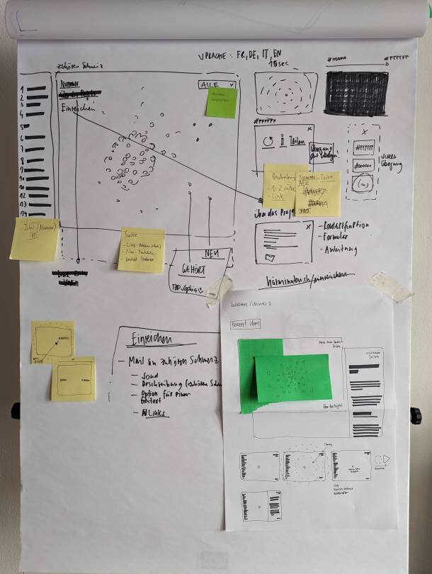
All the important disciplines were then represented in the workshop - i.e. project management from Zuhören Schweiz, artistic direction, but also development and design from Apps with love. In three hours of intensive work, it was possible to create a common understanding of the project and to agree on a conceptual approach. This included important parameters such as colour (minimal use), font (CI of the association) as well as considerations regarding the navigation concept, specific features, interactions and initial ideas for animations.

Concept sketches for "Hörminute"
Sketches from the Workshop with Zuhören Schweiz
Vor dem ersten Workshop vorbereitete skizzierte Ideen, werden im gemeinsamen Austausch ergänzt, korrigiert und konkretisiert.

Concept, design and technical realisation

The resulting concept combines several important principles:

  1. Minimalism in design: The essential thing about a minute of listening is the sound, the tone, the listening experience. Listeners should concentrate on what they hear and not be distracted by colours, text or buttons. The actual player of the individual "tracks" therefore does not need play, stop or skip buttons; individual listening minutes are displayed in an overview as dots or, at most, as a number.

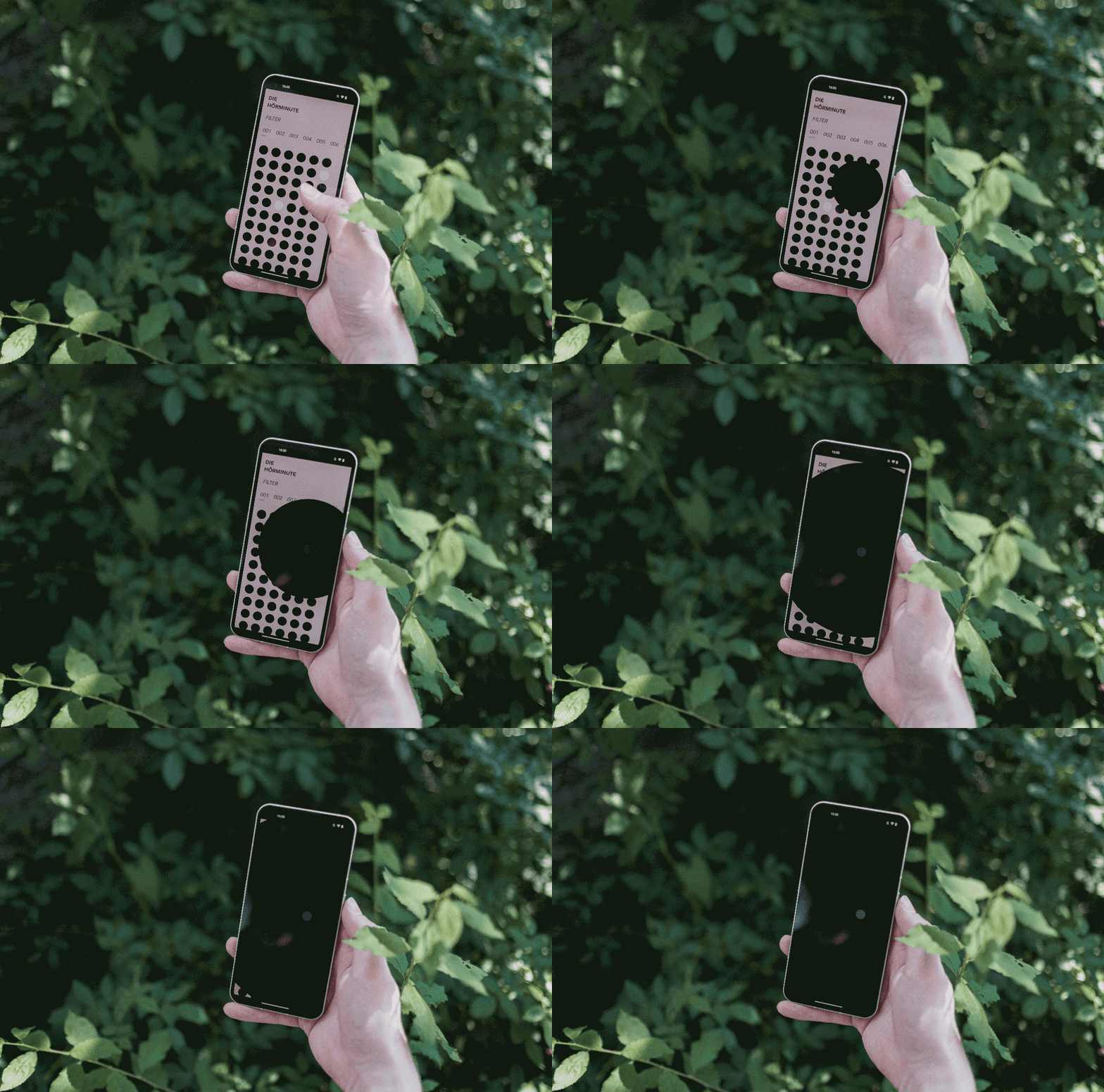
  2. Interaction and simplicity: By omitting elements familiar from conventional interfaces for playing sound content (e.g. Spotify, Apple Music or Soundcloud), there is a risk that users will not find their way around. So we developed gentle transitions and animations to show this: Something is moving here, something is happening, even if there is still silence at the beginning of a minute of listening. Dynamic hover states and a subtle progress indicator help people to find their way around.

  3. Accessibility on all systems: Listening minutes should be able to be heard regardless of the device. In this respect, the web platform was a mandatory requirement. Of course, we would also have liked to programme native apps for Android and iOS, but that would have gone beyond the scope of the project. But: hoerminuten.ch can be installed as a PWA on operating systems that support it.

Transition when playing a "Hörminute"

Technical realisation

Close and early dialogue between concept/design and development is important for the efficient implementation of a project. Especially when there is a reasonably tight schedule, both from the perspective of the planned scope and the launch date, and when the conceptual ideas are rather unconventional. This was particularly successful in this project: almost all participants were involved from the first workshop, and all others were involved immediately after the first workshop and worked on finding solutions for implementation. There was also a good deal of experimentation involved. In the end, as with so many of our web projects, we opted for a Statamic CMS in the backend. In the frontend, we let off a little more steam and relied on D3.js in addition to the parts implemented "by hand" with HTML, CSS and JavaScript.

Erste Experimente für die Animation bei einem Wechsel der Hörminuten-Kategorie
Jacqueline Beck

"Apps with love made it possible for an artistic project close to Zuhören Schweiz's heart to literally see the light of day - or send out its sound waves. The collaboration was characterised by agility and professionalism. It was a successful balance between creative aspirations and technical feasibility. The team skilfully took our balls and transformed them into an interactive sound universe - it was fun to create this platform together!"

Jacqueline Beck - Project Management & Communication Zuhören Schweiz

Conclusion

We are delighted that, in close collaboration with the Zuhören Schweiz project team, we were able to realise this unique project in such a short time. In many ways it stands out from the many other projects we realise in our day-to-day work, combining technology and individual solutions with artistic aspirations and the special nature of the content. And now: Zuhören! 👂

Overview
Eduard Zielke
Eduard Zielke
Project Management | Support & Help Desk
Our secret agent par excellence: disguised as a project manager during the day, he spies on customers as a bartender at night while shaking martinis, communicates in every language imaginable, and should things get really tricky, he can always fall back on martial arts. His name is Zielke - Eddy Zielke.
Sophia Villiger
Sophia Villiger
Creative Web Development
Web developer with an eye for detail. There is no Javascript framework she can't control and her curiosity for new things keeps us up to date on web trends even before questions arise on Stackoverflow. With 12 years of experience in coffee-drinking, projects with her are completed even faster.
Vera Schürch
Vera Schürch
Head of Concept & Design
Her eye for space and form turns every project into a delectable piece of eye candy. She’s a master of that old art that has all but disappeared – drawing by hand with an antiquated piece of equipment, the so-called pencil. This tool is moved over the paper and lines appear... It’s crazy!
Valentin Naegeli
Valentin Naegeli
Head of Marketing & Sales
If you want to develop an app with us, Valentin’s the one you’ll get the first info and tips from. He’s more than familiar with the whole app ecosystem and knows if an app is worth it or if investments are going to have to be made first in marketing or a website. We also know him as “The Wolf of Landoltstreet”.
Moqod
Web & App Development
We just noticed that you surf with Internet Explorer. Unfortunately, our website does not look so nice with it.

You want to know why that is?
We have written about it.

Blog

You need help with the changeover?
Get in touch. We are happy to help

Contact

Install a new browser?
There's lots of choice.

Browser