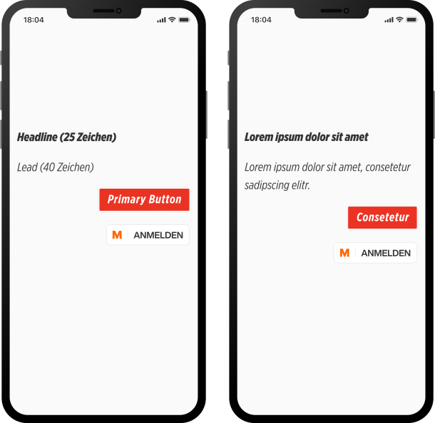
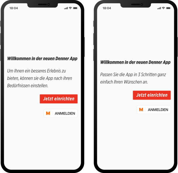
In recent years, we have increasingly realised how important the so-called microcopy - short texts on buttons, in error messages or call-to-actions - is for the success of digital products such as apps etc. That's why we explain in this and a follow-up blog what UX writing is and why the right texts make digital products better.
What is UX writing?
UX stands for user experience, i.e. the experience of users when dealing with a (digital) product. A good user experience includes not only a beautiful design and an easy-to-use user interface, but also good and easy-to-understand text elements.
UX writing involves formulating and naming these text elements within a user interface. UX writing aims to design texts in such a way that they are clear, easy to read, helpful and purposeful for users. A digital product should be usable without frustration.
The text elements are called "microcopy" because they are individual words and short text modules: Buttons, labels, error messages, onboarding texts, success messages, call-to-actions and so on.
Although microcopy only consists of single words, tiny text modules or short texts, these elements are essential for users to find their way around a digital product and navigate through it. Microcopy provides essential help in interacting with a digital product and is therefore a driving force for conversions.
Where is UX writing needed?
Basically, UX writing is needed wherever users are to perform an action via a user interface. This can be on a website, in an app or at a ticket machine. Every digital product consists of a multitude of components and a large part of them needs text to function.
In order for users to know what action is required of them (click, navigate, scroll, register, buy) in order to achieve the desired result, texts are needed that explain this to them as simply and precisely as possible.
2049; ux conference on mars
— Chris Coyier (@chriscoyier) October 11, 2019
in a groundbreaking new study, designers at mars daily news have discovered that putting a word next to an icon helps martians understand what the button does
Why is UX writing important?
Imagine an app without microcopy - unlabelled buttons, login screens or success messages. You quickly realise that these text fragments are an essential part of the user experience and that text is crucial to understanding how to use an app, website or web app.
As you can easily see, the onboarding screen above is meaningless without text. It needs at least an explanation of what the screen is about and labelled buttons so that users know what to do next.
When formulating these texts, it is important to observe the most important UX writing principles: Clear, concise, helpful.
This means that a simple, but detailed description, as it often arises in a first draft or can be derived from a user story, does not usually lead to the goal. In the next UX writing Blog, I will discuss how optimised microcopy is created and what you should look out for.
Digital products contain a multitude of text modules that are essential for their use. Accordingly, sufficient attention should be paid to these texts.
What is the goal of UX writing?
UX writing aims to design microcopy so that interaction with a digital product feels as easy and natural as possible. Good microcopy removes stumbling blocks, builds trust and guides users to their desired destination. It helps ensure that users have a positive experience when using a digital product and that a product is as easy to use as possible. Good microcopy should feel so natural that it is hardly perceived as such.
What can be achieved with UX writing?
UX writing not only has an impact on the user experience, but can also have a positive impact on business.
At Google I/O 2017, for example, the highly recommended keynote "How Words can make your product stand out" showed that changing the phrase "Book a room" to "Check availability" in a hotel search on Google led to a 17% increase in the engagement rate. A seemingly small change of three or two words that could make quite a difference. The first wording was perceived as too binding at this point in the user journey, so the process was abandoned. Users were probably unsure whether this action would result in a room being booked straight away. This can be cushioned with "Check availability". It becomes clear that users do not (yet) accept a binding offer.
A classic example that can be found again and again in the literature and best practices on UX writing concerns the purchase process on e-commerce platforms. Many transactions cannot be completed because the billing address entered does not match the address on the credit card. The solution to this problem is to add a single sentence to the check-out form, which massively reduces the error rate and reduces support requests.
The following example also shows how much the right text in the right place can achieve. Visit Norway A/B tested the following two variants. Although the additional text in the second variant is not necessary for navigation, it increased the click-through rate by 26%. The additional description explains the commitment and the mission behind the offers and is thus able to inspire confidence in the users.
With UX writing, conversions and engagement can be increased because the users are given security. By providing help with the right words at critical interruption points, support requests can be reduced and the users' trust in a product can be increased.
What is the difference between UX writing and copywriting?
Copywriting - loosely translated as "advertising copy" - is about writing texts for sales and marketing purposes. The aim is to persuade people to take action. Accordingly, advertising copy should attract the attention of (potential) customers, arouse interest, create demand and accordingly lead to a conversion. For example, people should download an app or buy a product.
UX writing, on the other hand, focuses on supporting users in the use of a digital product. Microcopy acts as a guide as soon as users engage with a product and helps to make a product as easy and understandable to use as possible. UX texts can therefore hardly be considered separately from design, navigation and flow. Microcopy must ensure the connections between the individual pages and functions, build logically on each other and integrate into the overall context of an app or website.
Often, however, the transitions between the two disciplines are fluid and copywriters and UX writers ideally work hand in hand to make the overall experience as coherent as possible.
Conclusion and outlook: Microcopy belongs to the UX and therefore optimised
UX writing is important because digital products consist largely of text and this is an integral part of the UX. Without text, apps, websites, web apps and the like are hardly usable and accordingly it is important that attention is paid to them and that they are analysed and improved from the user's point of view.
Optimised microcopy - the short text blocks on buttons, in error messages, empty states and so on - helps to remove hurdles in the use of digital products and make a product as easy to use as possible. This not only leads to a better UX, but can also have a positive influence on conversions, brand perception or sales.
More about the most important guidelines and principles of UX writing and the challenges you will face in the process in another blog...to be continued.
Helpful literature, blogs & talk
Torrey Podmajersky: Strategic Writing for UX (e.g. available from Orell Füssli)
Kinneret Yifrah: UX Writing & Microcopy (e.g. available from Orell Füssli)
Claudia Sinnig: UX-Writing . 8 Guidelines for Good UX Copy (blog post)
Thomas Kemp: UX Writing: How to use smart copy to enrich your product (blog post)
Google I/O 2017: How words can make your product stand out (Keynote Speech)
Readymag Blog: Writing is designing: Content designers on how to drive user experience with every word (Blog post)


