ASO - Tips and Tricks for App Store Optimization

9. September 2022 - from Maya Walther

Some time has passed since we last wrote about successful App Store appearances: It's been a whole 5 years since we wrote the blog "App Store Optimization - the right strategy for success".

A lot has changed in the App Stores since then and accordingly the information from the old blog is no longer up-to-date. High time for an update with our recommendations!

Why App Store Optimization (ASO) is important

Currently, there are around 7 million apps combined in the App Stores (around 4.7 million in the Apple App Store and 2.6 million in the Google Play Store). In 2021, the two stores generated gross revenue of about $133 billion.
In 2017, when we wrote the last blog on App Store Optimization, it was less than half as much revenue. The market has continued to grow steadily and competition is correspondingly high. 

The majority of app installations are still based on search queries in the app stores. Findability in the stores is therefore a central factor - no one can download an app that is not found in the stores. The goal is for the app to be findable through professional app store optimization and for more people to reach the app's detail page in the first place by searching the app store.

However, this alone is not enough. Once a potential user lands on an app page, it is also important to persuade the person to download the app. A visually appealing, easy-to-understand and convincing appearance plays a central role here. Potential users must be given a quick insight into the app that shows them what added value the app offers them. 

App Store Optimization includes the process of optimizing the appearance in the stores to such an extent that an app is found as the most relevant app when searching for certain words or phrases and is displayed at the top of the search results, as well as the design of visual elements that show the advantages of the app at a glance.

Specifics of the App Stores

It is important to know that the options, rules and search algorithms in the Apple App Store and Google Play Store are different. So, it is important to pay attention to these peculiarities in order to get the best possible result in each case. 
On the one hand, there are different elements in both stores. For example, while in the Apple App Store there is a subtitle, a keyword field and a promo text, in the Play Store there is a short description and a feature graphic. On the other hand, the algorithms in the two stores work differently: the Google Play Store works similarly to Google's regular search engine. This means that the most important keywords should definitely appear several times - without so-called "keyword spamming" - so that they are classified as relevant and an app is found under these search terms. 

In the Apple App Store, on the other hand, mentioning the same keywords several times does not lead to a better ranking. There, it is recommended to integrate as many relevant keywords as possible in the available space, so that the chance of being found under these words increases.

The most important App Store Elements at a Glance

  • Keywords

  • App name

  • Subtitle and promo text (Apple App Store only)

  • App descriptions (short and long)

  • Preview images / Screenshots

  • Feature graphic (Play Store only)

  • Preview video

  • Ratings and reviews

What we look for, what we recommend, and the differences between the main elements from the Apple App Store and the Google Play Store, are described in more detail below.

Keywords

We usually start every app store optimization with a keyword brainstorming and keyword research. The first step is to gather as many words as possible that are related to the brand, the app and its functionalities. Under which search terms should the app be found? What terms could the relevant target group search for? 
The collected keywords are then checked in AppTweak, our trusted ASO tool, for their search volume and ranking chances. More info about AppTweak can be found at the end of this blog.


The result is a list of keywords that should be integrated in the app name, subtitle and descriptions. In the Play Store, as mentioned above, it makes sense to integrate the words several times, as this gives them a higher weighting. In the Apple App Store, on the other hand, this is not recommended, as mentioning the same keyword multiple times does not lead to a higher weighting of the same. There is, however, a specific keyword field in which relevant words can be stored. This is not displayed anywhere in the Store, but the words entered in it are indexed by Apple and the app should be found under these search terms. There are 100 characters available, words are separated by commas, but without spaces. Apple forms partial words, variants and plurals and word combinations itself. 

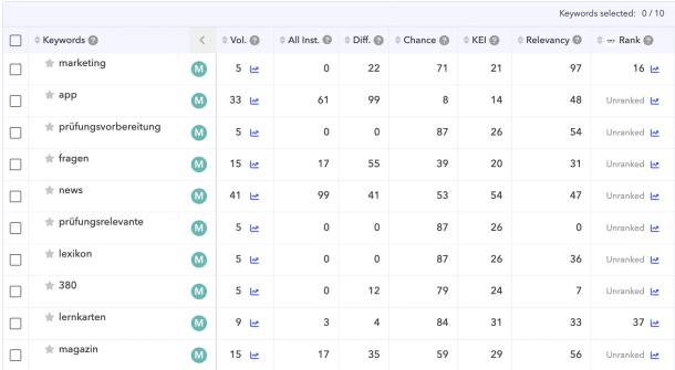
Keyword list App Tweak
Keyword list on App Tweak with information on parameters such as search volume, ranking chance or number of installations of the app

App Name

In both app stores, the keywords in the app name have a great weight in the algorithm. The app name is therefore important for discoverability and ranking in the stores and should contain the most relevant keywords.

In both app stores, 30 characters are available for the name, which is why we usually recommend using the same app name for both stores. The 30 characters should be used to give an idea of what the app offers. We recommend using the brand or company name and adding something to it to help potential users understand what the app is about. 

It is important to utilize the 30 characters as much as possible and mention the most relevant one at the beginning, as depending on that, the whole app name may not be displayed.

Examples:
Shoppi Tivoli - Shoppingcenter
Denner - Actions and Wine Shop

Subtitle (Apple App Store only)

The subtitle is also indexed and is therefore relevant for the findability and ranking of an app. The subtitle should give users an even better idea of what the app is about. Keywords from the name should not be repeated, this does not improve visibility. So, we better use the available space to include other relevant words.

Examples:
Become a VIP - Redeem Vouchers
With practical shopping list

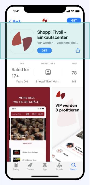
Name and subtitel of the Shoppi Tivoli App in the App Store

Promotional Text (Apple App Store only)

Promotional text is a short text consisting of maximum 170 characters and is displayed at the beginning of the long description. Although it is not indexed and the keywords it contains have no influence on the ranking, the promotional text can help to persuade potential users to download the product. Unlike the other content, the promo text can be changed at any time, which is why it is suitable for promoting seasonal offers, news, or similar.


Short Description (Play Store only) 

Instead of a subtitle and a promo text, there is a short description in the Play Store. There are 80 characters available, which is displayed at the beginning of the long description and thus as a preview of it.

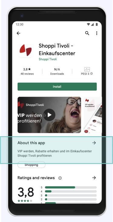
Short Description of the Shoppi Tivoli App in the Play Store

The short description is taken into account by the Play Store algorithm, which is why it should contain the most important keywords. The goal of the short description should be to briefly and concisely explain to potential users what the app can do and give them a better idea of what the app is about without them having to click and read the long description. This can help increase the conversion rate.

Long Description

Basically, similar principles apply to long descriptions in the Play Store and the App Store: The description can help convince potential users to download an app by explaining in more detail what the app is about, what functionalities it contains, and what added value it brings. It is important that the description is easy to read: line breaks, short paragraphs or bullet points can help. It should also be communicated in the tone of voice of the brand.

Since a large part of the description is hidden for the time being, the first 250 or so characters in particular should get to the point and grab the reader*s attention. We recommend that at least 1000 of the available 3000 characters are utilized.

Keyword Density in the Play Store

The Play Store description is taken into account by the store algorithm for ranking and contributes significantly to the discoverability of an app in the Play Store. Therefore, relevant keywords should appear around 3-5 times in the description so that they are classified as relevant by the algorithm (keyword density). Keyword stuffing - mentioning the same word too often - should be avoided, however.


Relevance for iTunes Page in the Apple App Store

In the Apple App Store, the long description is not indexed. However, this does not mean that it should be neglected - it is used for ranking the iTunes App Page, for which "regular" SEO principles apply. Therefore, we recommend to use at least 1000 of the 3000 available characters for the long description in the Apple App Store as well and to integrate the most important keywords. 

Apart from that, the long description naturally helps to arouse the interest of potential users, to explain the most important information about the app and thus to persuade them to download it.

Preview Images in the App Stores

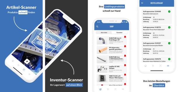
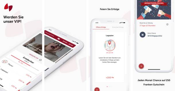
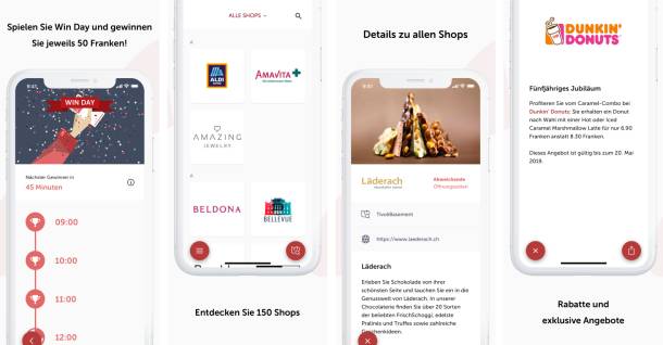
People can remember visual information better and faster than information in the form of text. Thumbnails, also called screenshots, are therefore a very efficient means of persuading potential target customers to download the app and turning them into effective users. It is therefore worth investing in an appealing visual appearance. The preview images should show the most important functionalities of the app and give an insight into the appearance of the same. 

We recommend providing the screenshots with a background and meaningful titles, so that the benefits and most important functions can be seen at a glance. Furthermore, it makes sense to show the screenshots that are the most visually appealing in the first place. Uniform devices and uniform status bars (battery, reception, wifi, time) also contribute to a clean visual appearance.

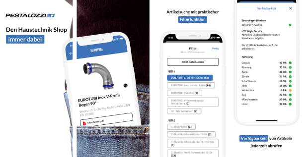
Preview Screens of the Haustech Mobile Pestalozzi App
Preview Screens of the Pestalozzi Haustech Mobile App 2/2
Preview Screens Shoppi Tivoli App 1/2
Preview Screens Shoppi Tivoli App 2/2

Feature Graphic (Play Store only)

In the Google Play Store, in addition to the preview images, there is also a feature graphic. This is displayed as even before the screenshots and offers space to present the most important elements and benefits of an app. 

If a preview video is uploaded, the feature graphic becomes the preview image of the video. In this case, a play button is placed over the feature graphic, which is why the most important elements should not be placed in the center. Moreover, the default format of the feature graphic does not correspond to the common video format, which is why it is possible that the graphic is slightly cut off at the edges. So you should pay attention to the safe zones for text content.

Play Store Feature Graphic Patrouille des Glaciers App
Play Store Feature Graphic Shoppi Tivoli

Preview Videos

In addition to the preview images, a preview video is particularly suitable for giving potential users an insight into the app and convincing them of its advantages. Here, too, the guidelines differ between Apple and Google.

Apple is more restrictive in its rules for preview videos than Google. The video can be a maximum of 30 seconds long and only content that can be seen in the app can be shown. For example, no devices or people interacting with the app can be shown. As a rule, videos in the Apple App Store are in portrait format, but videos in landscape format are also common for games.

In the Play Store, preview videos are always queer format. A duration between 30 seconds and 2 minutes is recommended. The Play Store preview video can simply be added using a YouTube link, so the video must be uploaded to YouTube. The only thing to note is that the video does not belong to a playlist and that monetization is disabled for the video.

SRK Babysitting App Preview Video for the Play Store
SRK Babysitting App Preview Video for the Apple App Store
Peeps App Preview Video for the Play Store
Peeps App Preview Video for the Apple App Store

App Reviews and Ratings

The ratings of an app provide potential users with information about the quality of an app and contribute significantly to the purchase or download decision. 

Our experience shows that users tend to give a rating if they are either very satisfied or very dissatisfied with the app. In order to collect as many positive ratings as possible, it is worth actively asking users for a positive rating in the app. This can be particularly effective after a successful action, e.g. a user has successfully ordered a product via the app. This automatism can be integrated with a simple SDK.

In the Apple App Store, you can decide with each app release, i.e. when a new version is published, whether you want to keep the existing ratings or start again from 0. However, Apple recommends using this feature sparingly, since an app with few ratings tends to be downloaded less. Also, it is important to note that resetting the ratings (1 - 5 stars) does not delete the written ratings.

Custom Product Pages

In both stores it is possible to design custom App Store entries for an app, so-called "Custom Product Pages". Up to 35 (Apple) or even 50 (Google) different variants of an App Store entry can be created. For example, the preview images and videos, the promo text or the description can be changed. 

Custom product pages make it possible to highlight different features, content or offers and thus target specific personas or segments of the target group. 

For example, operators of a fitness app that covers different activities such as yoga, cycling, running and swimming could create store entries for these individual sports. Custom product pages can be accessed via individual URLs and can therefore be used in targeted online advertising campaigns.

More about Custom Product Pages in the Apple App Store
More on Custom Product Pages in the Google Play Store

AppTweak - Tool for data-driven ASO

There are various tools that help one with app store optimization. Our trusted tool is AppTweak. 

AppTweak provides the most important insights and information it takes to optimize app store appearances. Using a traffic light system, AppTweak shows at a glance which parts of the App Store appearances can still be improved.

AppTweak Summary App Store Appearance
Traffic light system on AppTweak, which shows which elements can be improved

The detail view then contains further information about text lengths, number of screenshots and so on. New names and descriptions can be tested directly in AppTweak, and the number of characters used is always displayed. Nice to have: AppTweak allows you with the "Store Listing Preview" function to test how different titles, subtitles and descriptions will finally look in the stores.
AppTweak allows you to track competing apps, making it easy to compare your own App Store listing with those of your competitors. 


Probably the most important feature of AppTweak, however, are the insights into individual keywords. AppTweak provides information about search volume, estimated downloads generated by a keyword, the level of competition, the chance that the app will be ranked for this keyword, the current ranking of the app for a certain keyword and much more.
This extensive data helps filter out which keywords are most likely to be integrated in the title, sub-title, descriptions, keyword field, etc.

ASO Best Practices - Summary of our Recommendations

  • Start with keyword research 

  • Mention most relevant keywords at the beginning of the app name 

  • Add something to the name that gives an idea of what the app is about.

  • Use the maximum number of characters available

  • Do not integrate keywords more than once in the Apple App Store

  • In the Play Store keywords must be mentioned several times

  • Write the beginning of the description in an interesting way, because the rest will be cut off

  • Invest in beautiful, meaningful thumbnails and videos

  • And finally, very important: App Store optimization is not a one-time thing. It is worth to check the performance regularly and adjust it if necessary.

Do you need help improving your App Store presence? Contact us, we are happy to help!

We just noticed that you surf with Internet Explorer. Unfortunately, our website does not look so nice with it.

You want to know why that is?
We have written about it.

Blog

You need help with the changeover?
Get in touch. We are happy to help

Contact

Install a new browser?
There's lots of choice.

Browser