Design expertise since 2010

Since 2010, we've been conceptualizing and designing digital products – design is one of our core competencies. We specialize in creating beautiful and user-friendly digital products that simplify people's everyday lives.

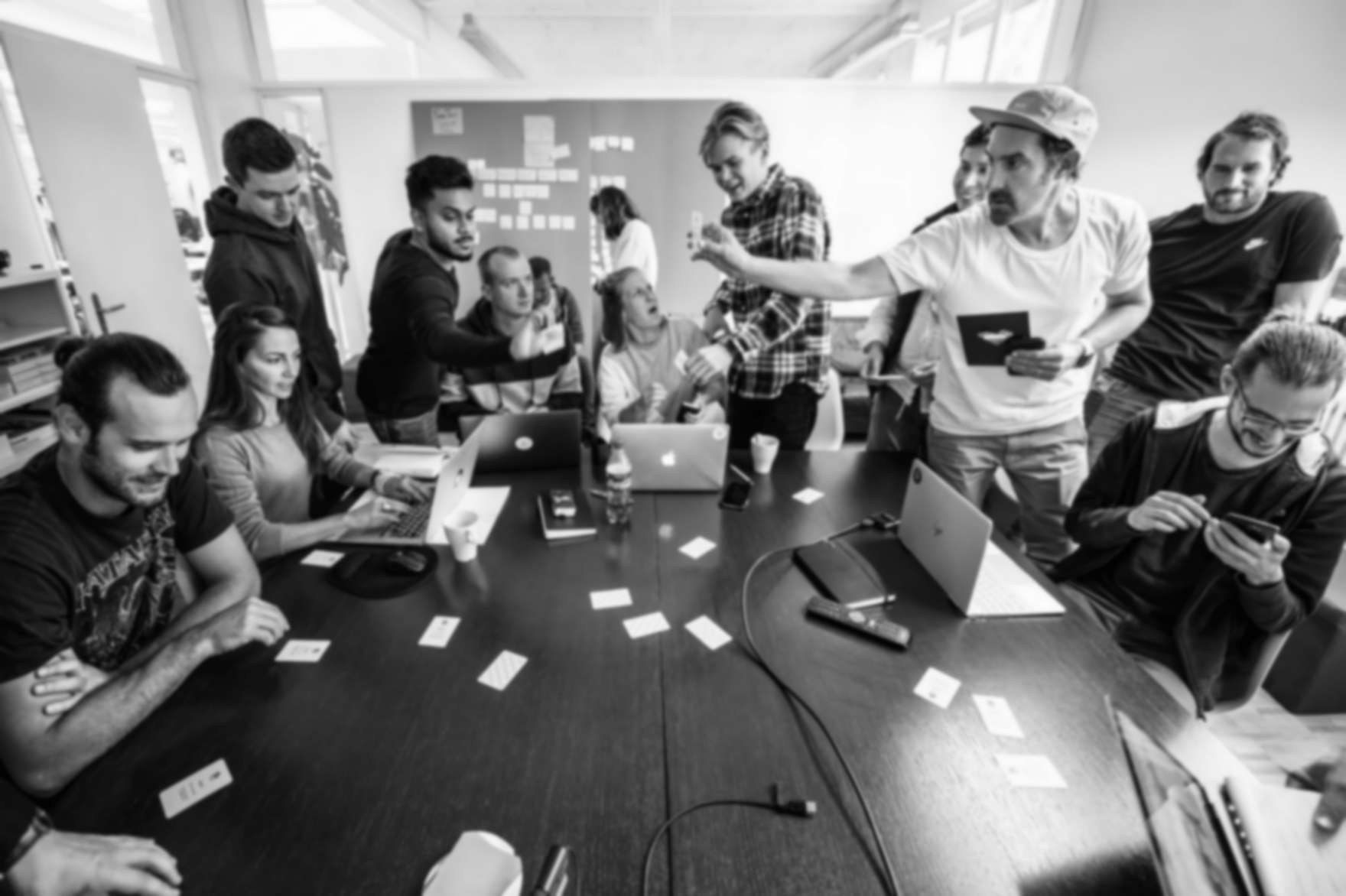
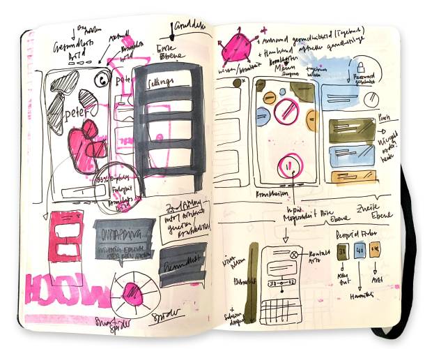
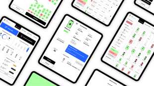
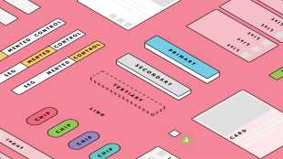
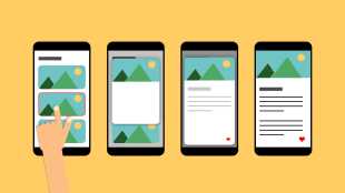
Our concept and design team creates user experiences that are clear, intuitive and easy to use. Through close collaboration between design, user research, and software engineering, we create apps and websites distinguished by their consistency and precise focus on their target audiences. A well-thought-out concept and a clear design language result in user experiences where features and content can be used effortlessly – and with enjoyment.

Sketchbook
Even with digital products, the concept and design process often begins with sketches on paper.

App and web design: the interplay of aesthetics and functionality

App and web design is much more than just creating attractive interfaces. It's the art of combining aesthetics and functionality so that digital products not only look good, but are also intuitive and efficient to use.

Two disciplines play a central role in this process: User Interface (UI) design and User Experience (UX) design.

UX lays the foundation, UI provides the look and feel

While UX design focuses on the overall user experience – from guiding users and structuring information architecture to defining functionality – UI design focuses on the visual design of the user interface itself.

Both disciplines are inextricably linked: without thoughtful UX, even the most beautiful UI is useless – and without an appealing UI, even the best functionality remains invisible.

UI design elements

The user interface is the point of interaction between humans and machines. UI design determines how this interface is designed and brought to life. The colors, icons and fonts used give a digital product its character and visual identity. To make an interface feel dynamic and engaging, UI design also includes animations, transitions, components and their various states, as well as suitable sound and haptic concepts. Responsiveness and accessibility standards are equally essential parts of effective UI design.

CICD as a basis

In most cases, digital products should clearly reflect the company or organization behind them. This means that design elements are based on existing corporate identity and corporate design guidelines (CICD) or complement them. In any case, CICD serves as a key foundation for visual design. This also means that when a completely new brand is created for a digital solution, at least a rudimentary CICD must be defined.

Colors & fonts

A CICD framework needs to be expanded if it doesn't include the necessary parameters, information, and definitions for the digital world – for example, if colors are defined for print rather than screens, or if typefaces aren't licensed or simply unsuitable for digital products.

Establishing clarity around colors and typography is an important milestone on the path to the final design – it provides a solid starting point. For long-term efficiency and consistency, however, much more needs to be documented in a design system. This includes defining color and text styles. For typography, this also means specifying font sizes, line heights, and colors, as well as determining which combinations are permitted. In this way, a clear hierarchy is created. In web design, traditional HTML tags such as H1, H2, and H3 are also defined as part of this structure.

Brand development of Fiveup - logo development, CI colors and font selection

UI components

In order to implement features while ensuring that not every button looks different, it's important – even if you aren't building a full design system – to define the most important components. These typically include:

  • Navigation elements such as menus or tab bars

  • Buttons and related elements: buttons, toggles, checkboxes, dropdowns

  • Form components such as text fields and date pickers

  • Error messages and status indicators

  • Dialogs, pop-ups, popovers and flyouts

  • Layout elements such as cards, tables or accordions

This isn't a complete list. Every concept requires a different combination of components. Sometimes more, sometimes less. Sometimes simple, sometimes complex.
Since IT projects are known to change in content and structure right up until launch, it always makes sense to work with standardized components, even for small projects. This means that a small change can then be applied to all instances in a matter of seconds, preventing bottlenecks and ensuring consistency.

Animations & micro-interactions

Digital user interfaces shouldn't feel static: this often only becomes really noticeable when animations and so-called micro-interactions are missing. Consciously or unconsciously, users expect digital products to behave and move in a certain way. These expectations can vary depending on the platform, whether it’s a website, an iPhone app, an Android app, or even a desktop application. With our experience, we know exactly where a transition, animation or micro-interaction makes sense: Does the interface feel too static? Does it come across as too playful for your brand?

These and many other details need to be consciously designed. Depending on the use case, we rely on different technologies such as Swift UI, Jetpack Compose or Keyframes on the web. Tools like Rive and Lottie are also part of our toolkit for more complex requirements.

More detailed information on this topic can be found in the blog post "Micro-interactions and animations in apps – what's the use?".

Tab bar with animated icons

Sound

Sound can also be an interface between humans and machines. In most cases, applications are silent. Sounds, such as error alerts or notifications, are typically handled by the operating system.
But not always: Apps that run in the background or function without active user interaction often use sounds to alert users. In such cases, similar design questions arise as with color: What does your brand sound like? Do you rely on system defaults, or do you create something distinctive and custom?

Haptics

When it comes to visual designs, we often talk about "how it feels". But our smartphones also appeal to our sense of touch. Tactile or haptic feedback - the perception of events via our skin – is made possible by vibration motors in our devices. Haptic feedback is an often underestimated part of interface design because it's usually perceived subconsciously. Precisely for that reason, it plays an important role and is especially expected – even if unconsciously – in native apps. In web applications, haptic feedback can also be supported, depending on the browser, operating system, and device settings.

Accessibility

When it comes to visual appearance, it's important to ensure not only that a digital product looks appealing and fits in with existing corporate design and corporate identity guidelines, but also that the UI is designed to be accessible.

For example, are color contrasts sufficiently high, can font sizes be adjusted without completely ruining the design, and are the technical requirements for screen reader compatibility met? Accessible design isn't an "add-on feature" or "nice-to-have" – it's essential. It doesn't stand in anyone's way, but rather ensures that a digital solution is accessible to as many users as possible. Keyboard navigation for example, is crucial when you have a broken finger and can't use the mouse properly. Readable text is vital for someone temporarily experiencing vision difficulties, such as after surgery.

A11y - Blindspot Accessibility provides a good overview of the topic, for example.

Our blog posts also contain content on the topic of accessibility:

Because this issue is fundamentally important to us, we're also a member of the patrons' association of the Access for All Foundation.

Good design is as little design as possible

Although all of these elements are important, it’s essential not to lose sight of the content itself. Text and imagery need room to breathe – interfaces shouldn’t be cluttered with unnecessary UI elements. German industrial designer Dieter Rams captured this perfectly in his 10 principles for good design, by putting the first nine principles of his list into perspective with the tenth principle: "Good design is as little design as possible". We follow this principle whenever possible.

Broad experience

Our concept and design team consists of experts with diverse backgrounds and knowledge across a wide range of disciplines. This allows us to offer not only "traditional" digital product design, but also additional services that are necessary for the successful development and marketing of a digital product:

  • Designing print materials and preparing them for production

  • Design 2D animations and prepare them for digital use

  • Create, texture and animate 3D models

  • Producing custom sounds for feedback interactions

Do you need support with concept and design? Feel free to reach out via email!

Overview
Till Könneker
Till Könneker
Creative Direction | Co-Founder
Hat einen gefürchteten Adlerblick und wacht über die Qualität unserer Produkte. Hängt oft seinen Gedanken nach und schmiedet Pläne, wie Apps with love ins nächste Level kommen könnte ohne ein Leben zu verlieren. Er mag Katzen, Kinder und Lakritze.
Florian Gygax
Florian Gygax
Concept & Design
User Interface Experte mit Bootsführerausweis. Wäre er nicht vom Goldenen Schnitt besessen, würde er jetzt wohl auf einem See oder Meer kreuzen und sein Leben mit einem Glas Pastis geniessen.
Res Finger
Res Finger
Concept & Design
Mit Ruhe und Gelassenheit erfindet er die wildesten Ideen. Korrekt muss es sein und so einfach zu bedienen, das selbst der DAU im Schlaf zurechtkommt. Ihm entgeht nichts, seit er damals in den RedBull-Topf gefallen ist.
Stefan Spieler
Stefan Spieler
Concept & Design
Design Profi in allen Belangen. Trägt jetzt Bart, ist aber trotzdem für jeden Blödsinn zu haben, wenn es mit Design, Games, 3D, Ping Pong, schwimmen, reiten oder lesen zu tun hat. Einer der ersten in diesem Laden und immer noch einer der besten.
Nick Gerber
Nick Gerber
Concept & Design
Er kennt jeden Shortcut und jedes Easteregg, kein Softwaretool, welches er nicht schon getestet und verflucht hat. Die klare Gewinnerin: Notion. Damit arbeitet er so strukturiert, dass nebst dem Konzipieren, Designen und Entwickeln von Websites Zeit bleibt, um die wirklich wichtigen Fragen des Lebens zu stellen. Zum Beispiel, wer die Töggeli-Eigentor-Statistik anführt.
Aaron Gisi
Aaron Gisi
Concept & Design
Mit seiner strukturierten Arbeitsweise hat er schon Ordnung in manchen Bereich gebracht - zum Beispiel in unseren Dschungel von Prozessgrafiken. Nach einem Abstecher in die Welt des Supports setzt er seine Skills nun voll und ganz im Bereich Konzept und Design ein und bringt dank seiner kritischen Fragen so manche Verbesserung in unsere Projekte. Wenn er nicht gerade supported, designed, gestaltet oder mit neuen Technologien tüftelt, ist das Multitalent ehrenamtlich engagiert.
Livia Stöcklin
Livia Stöcklin
Intern Concept & Design
Von Tennis über Gaming zu Skifahren, von KV über Support zu Design: Livia ist vielseitig interessierte Designerin mit Bankerfahrung und einem so feinen Gespür für die Bedürfnisse von User*innen, dass ihr das innert kürzester Zeit top Feedbacks unserer Kund*innen einbringt.